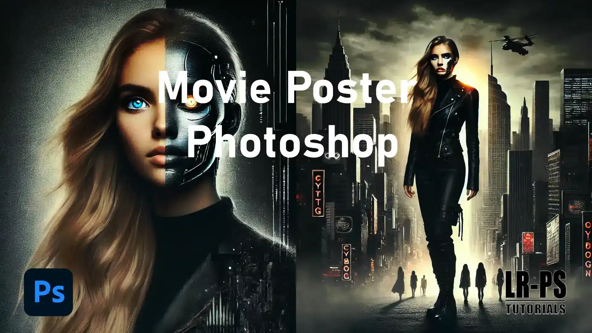
Movie Poster in Photoshop: Create Stunning Designs with These Essential Tips
Movie Poster in Photoshop: Create Stunning Designs with These Essential Tips
As someone passionate about design, I’ve always found creating a movie poster in Photoshop an exciting challenge.
Today, I’m going to guide you through all the necessary steps to make your movie posters stand out.
Let’s get started!
Table of Contents
Setting Up Your Document
Let’s get started with our poster project in Photoshop by picking the right size. Industry standards suggest 24×36 inches. These dimensions make printing and displaying straightforward.
Additionally, utilizing tools like the patch tool in Photoshop can help refine any imperfections in your poster design. To add a creative touch, you can explore blending modes in Photoshop to enhance the visual appeal of your poster.
Steps to Set Up Your Document
Open Adobe Photoshop and create a new poster project.
Fill in 24 inches for width and 36 inches for height.
Set the resolution to 300 pixels per inch for quality prints.
Click "Create," and you’re good to go.
Essential Tools for Movie Poster Templates
When designing a movie poster in Photoshop, having the right tools can make a significant difference.
Each tool serves a unique purpose, from adding fine details to quickly selecting specific areas.
Below is a table that outlines the must-use tools and their best uses, helping you streamline your design process and achieve professional results efficiently.
Tool
Purpose
Best Used For
Brush Tool
Adding intricate details
Fine-tuning elements
Magic Wand Tool
Selecting specific areas
Quick selection of similar colors
Adjustment Layers
Tweaking colors, brightness, and contrast
Non-destructive editing
Movie Poster Templates
Pre-designed layouts for quick setup
Fast-tracking design process
Lightroom Presets
Instantly change the look of your background
Applying consistent visual styles
When your canvas is ready, remember to also incorporate adjustment layers and the templates at your disposal.
Adjustment layers: Let you tweak colors, brightness, and contrast without messing up your original layers. If you want a pale yellow background, these layers make it easy to experiment until you are satisfied.
Movie poster templates Can speed things up. They come with pre-designed layouts where you just add your details. It’s like having a head start.
If you’re looking to optimize your images for social media after creating your poster, consider checking out these Lightroom export settings for Instagram and other social platforms.
Character Arrangement
Think about how you arrange left and right characters. Typically, place the main character at the center or slightly off-center, with secondary characters on the sides.
To make characters stand out, use selective focus in Photoshop to draw attention to the main character while keeping the background elements less prominent.
Additionally, employing the dodge and burn in Photoshop techniques can help to enhance the highlights and shadows, giving more depth and dimension to your characters..
Background Images for Movie Poster Photoshop
Background images add visual appeal. Use cityscapes, urban landscapes or abstract designs to fit the movie theme. Blend photos seamlessly for a cohesive look.
Pro Tip: Blend photos seamlessly for a cohesive look using the content-aware scale in Photoshop, which allows you to resize and manipulate images without distorting key elements.
Additional Tools
Use the brush tool for intricate details.
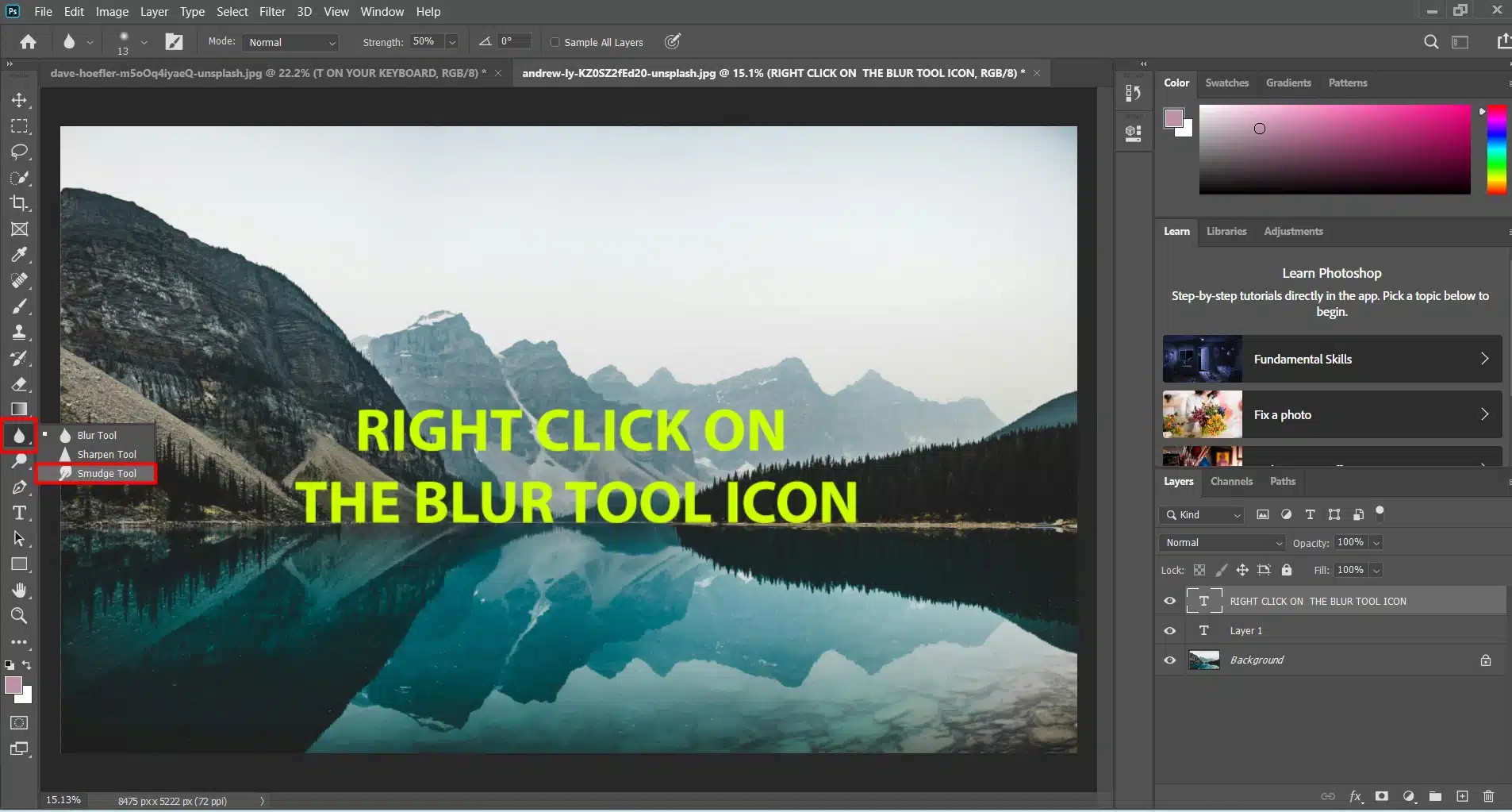
The smudge tool is excellent for blending edges, especially if you aim for jagged and torn edges in your design.
Color and Style for Movie Poster Photoshop
Create a captivating poster in Photoshop by using the adjustment layer to modify your color story. Adding a horror preset or teal-orange tone brings mood and style.
Pro tip: Always save your work at different stages. If something goes wrong, you can revert without losing everything.
Setting up your canvas size correctly and using the right tools makes your work easier. For instance, the object selection tool in Photoshop can help you isolate and manipulate elements with precision.
Designing the Background for Movie Poster Photoshop
Selecting a Background Image for Movie Poster Photoshop
Alright, let’s pick the right background for your poster. This sets the scene and mood. Think about the movie’s genre (horror, drama, or action). Each has its own look.
Use high-resolution images to avoid blurry results. Websites like Unsplash and Pexels are good sources.
For a horror poster, choose a dark forest or an abandoned building. These backgrounds create a spooky vibe.
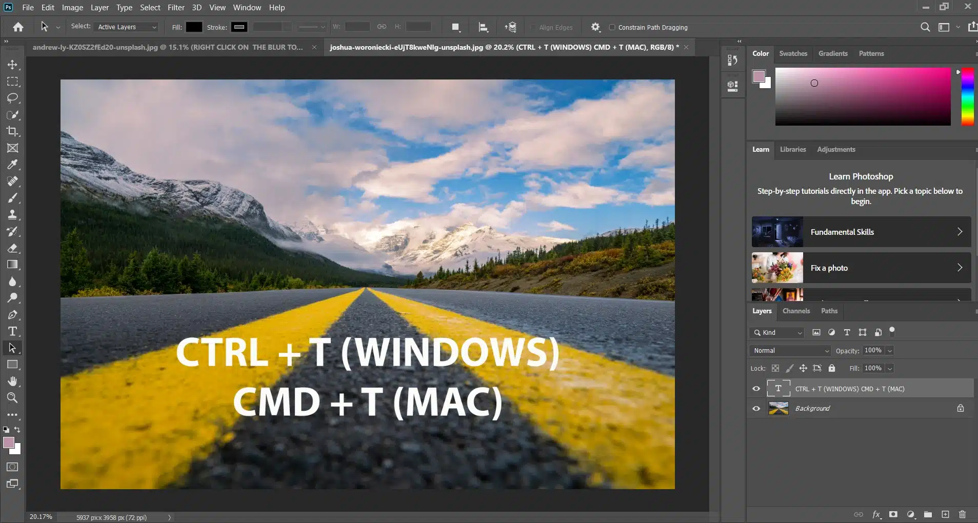
Import your chosen image into Photoshop. Cover the entire canvas with it. Use the free transform tool (Ctrl + T) to adjust its size. Make sure it fits perfectly.
Applying Filters and Adjustments for Movie Poster Photoshop
With the background in place, it’s time to tweak it. Filters and adjustments make a big difference.
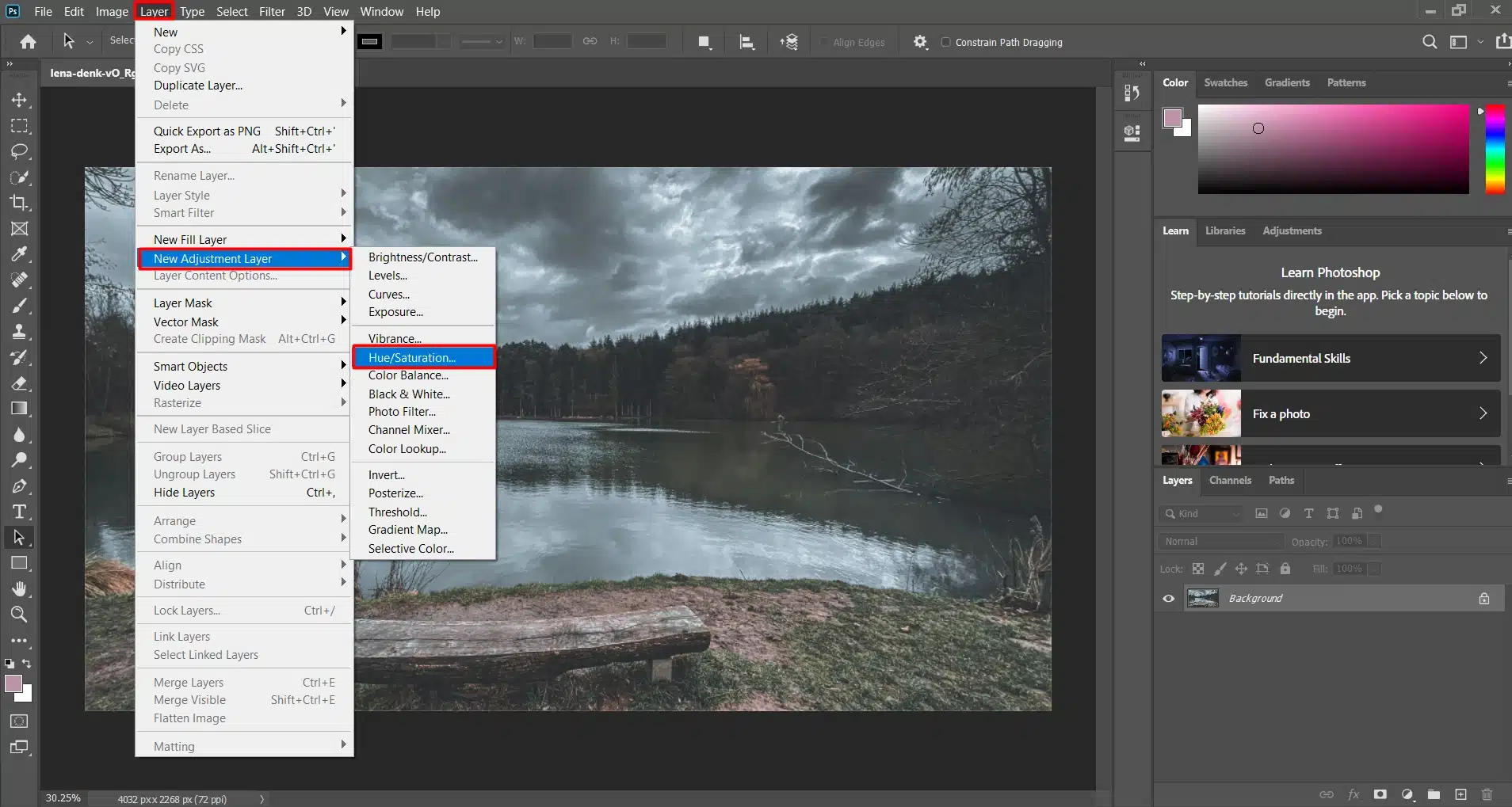
Add an adjustment layer. Click the adjustment layer icon at the bottom of the layers panel. Choose options like Brightness/Contrast, Hue/Saturation, or Levels. For horror, darken shadows and desaturate colors for a gritty feel.
Experiment with the blend mode. Find the dropdown at the top of the Layers panel. Modes like Multiply, Overlay, or Soft Light create different effects. This helps your background blend well with other elements.
For extra flair, use Lightroom presets. They can change your background's look instantly. Presets for horror can add the final touch.
Consider another adjustment layer for curves. This increases contrast and highlights areas that need to stand out. It adds depth to your image.
The magic wand tool is handy for selecting parts of your background. Use it to keep some areas sharp while blurring others.
Apply a slight Gaussian Blur to certain parts. This smooths out harsh lines and makes the image coherent. Gradual transitions make the background more appealing.
Pro Tip: Always start with the background. A strong foundation simplifies your workflow. Trust me, your design will thank you!
Mastering focus stacking with Photoshop is a must for creating detailed images. This technique, combined with filters and adjustments for movie posters, ensures your visuals are captivating and professional.
Adding the Main Elements for Movie Poster Photoshop
Inserting the Main Character in the Poster
Alright, it’s time to bring in the main character. Your background looks good; now, let’s add the star.
Open your character image and drag it onto your canvas.
Too big or small? Use the free transform tool (Ctrl + T) to resize. Make sure the character stands out.
Pro Tip: Try the smart filters in Photoshop to apply non-destructive adjustments, enhancing your character’s appearance without losing original quality.
Positioning the Character in the Poster
Position the character for maximum impact. The center or just off-center usually works best. This helps the audience focus. Keep the character layer above the background layers.
Creating Shadows in the Poster
Create a layer under the character for shadows. Use the hard round brush with low opacity. Draw a shadow following the direction of light in your background. This adds realism.
Saving Your Work
Save your work frequently. Losing hours of work is frustrating. Trust me, I’ve been there. Save often.
Color Adjustment
Now, let’s blend the character with the background. Start with an adjustment layer for Hue/Saturation. This matches the colors of the character and background.
Blend Modes
Experiment with blend mode options like Overlay and Soft Light. They help the character fit into the scene. Lower the character layer’s opacity slightly if needed.
Edge Blending
Don’t ignore the edges. Use the smudge tool to softly blur the background or the edgesof the character. A gentle touch creates a natural transition.
Adding Lighting Effects
Adding lighting effects is a must. Create a new layer above the character. Use a soft white brush to paint light sources, then lower the opacity.
This mimics light hitting the character.
Creating Shadows
Add some shadows. Duplicate the character layer, fill it with black, and place it behind the original.
Use Free Transform (Ctrl + T) to distort it until it looks like a shadow. Adjust the opacity for realism.
Masking Techniques
Use masking techniques to hide parts of the layer without deleting them. For example, if your character stands before a dramatic sky, use a mask to soften the overlap. This adds depth to your design.
Final Adjustments for your Poster
Test, adjust, and test again. Your eyes are the best judge. If it looks right, it probably is. The goal is to have your character and background working together.
Pro tip: Consider using Placeit’s poster maker templates. These templates offer pre-designed layouts that can speed up your process.
Upload your design elements and see how they fit together quickly.
Incorporating Text
Choosing Fonts for Movie Poster Photoshop
Fonts make or break your movie poster. Think about your movie’s theme.
Horror flick? Go for creepy fonts like “Chiller.”
Action movie? Choose bold fonts like “Impact.”
Pick a title font that’s clear and readable from a distance. Avoid overly stylish fonts. Make sure viewers can read your title right away.
Match your fonts with your movie’s vibe. Don’t use whimsical fonts for a serious drama. The goal is to make it fit.
Adding the Title
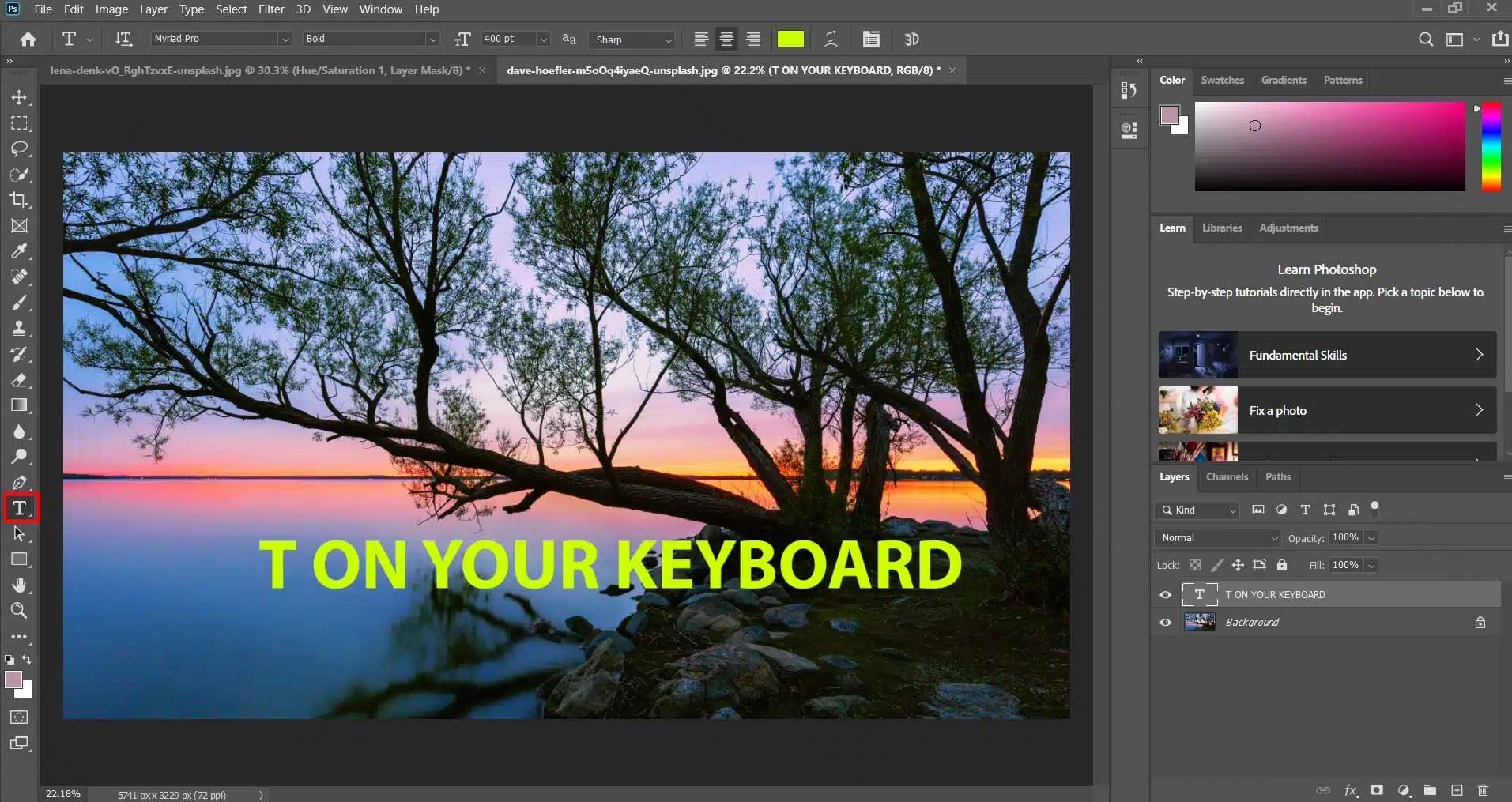
Your poster needs a title. It’s the first thing people see. Use the text tool (T on your keyboard or access it through the text box). Click where you want the title. Type it in your chosen font.
Font placement matters. Place the title at the top or center for maximum impact. People read top-down, so the top is a natural spot.
If you’re feeling daring, experiment with positioning. Just keep it readable.
Use the free transform tool (Ctrl + T) to tweak size and position. It’s your canvas; make it look right.
Including Additional Text
Apart from the title, add more text like taglines, actor names, or release dates. This adds excitement and information.
For taglines, smaller fonts work best. They shouldn’t overshadow the title but should still be readable. Use the text tool (T) to add them. Short, catchy lines work well.
Place actor names at the bottom or below the title. Use larger fonts than taglines but smaller than the title.
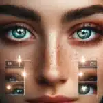
Match the color and style of your text to your background. Use light-colored text for contrast on dark background. This is especially useful when working with portrait text effects.
Remember font hierarchy. Make your most important text(title) the most prominent. Taglines and other details follow. This guides the viewer’s eye naturally.
Learning to remove background in Photoshop is a valuable skill for any designer. This technique is especially useful when including additional text in your designs, allowing for cleaner and more professional layouts.
Final Touches When Creating a Movie Poster in Photoshop
Alright, we’re almost done. You’ve worked hard on your movie poster, and now it’s time to add those final effects that make it shine.
Creating Depth with Light and Shadow
Use the rectangle tool to draw shapes for highlights and shadows.
Keep the opacity low to make subtle changes.
This makes everything on your poster stand out.
Adding a Spooky Vibe for Horror Posters
Use horror presets if you have them.
Adjust "Hue/Saturation" to desaturate the image.
Create a "Vignette" effect by filling a new layer with black and erasing the center with a soft brush.
Lower the opacity for an eerie feel.
Enhancing Text with Texture
Copy your text layer and place it above the original.
Try Overlay or Soft Light blend modes.
This gives your text a worn look that matches a gritty background.
Consistency Check
Ensure lighting and colors match.
Fine-tune your layers.
Save your work often to avoid losing progress.
Detail Inspection
Zoom in and check for details.
Look for pixelation, blurry sections, or mismatched edges.
Use the smudge tool to blend these areas.
If something looks off, go back a few steps and fix it.
Text Alignment
Check your text alignment. Misaligned text is noticeable.
Use the guideline tool to ensure everything is neat. A tidy poster looks professional.
Creating a movie poster in Adobe can be a fun and rewarding project. I’ve shared my experience on how to choose backgrounds, arrange characters, and blend everything seamlessly. Using tools like the brush tool, magic wand tool, and adjustment layers has helped me make detailed and professional-looking posters.
If you want to learn more and improve your skills, check out my Photoshop Course and Lightroom Course. They offer step-by-step guidance and tips to take your designs to the next level.
Happy designing!
If this article has helped you, then Like and Share it with your friends
$2,061.00Original price was: $2,061.00.$1,061.00Current price is: $1,061.00. 27584
Download Your Free Guide Now!
Discover the secrets of photography with our printable guide! Master essential techniques like aperture, shutter speed, and ISO to create stunning images. Get your free printable PDF now and start turning your snapshots into masterpieces!