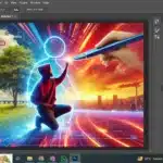
Mastering the art of gradient in Photoshop is a powerful skill that can dramatically enhance your design projects.
This versatile tool allows you to create stunning effects by blending colors and changing their opacity across an image.
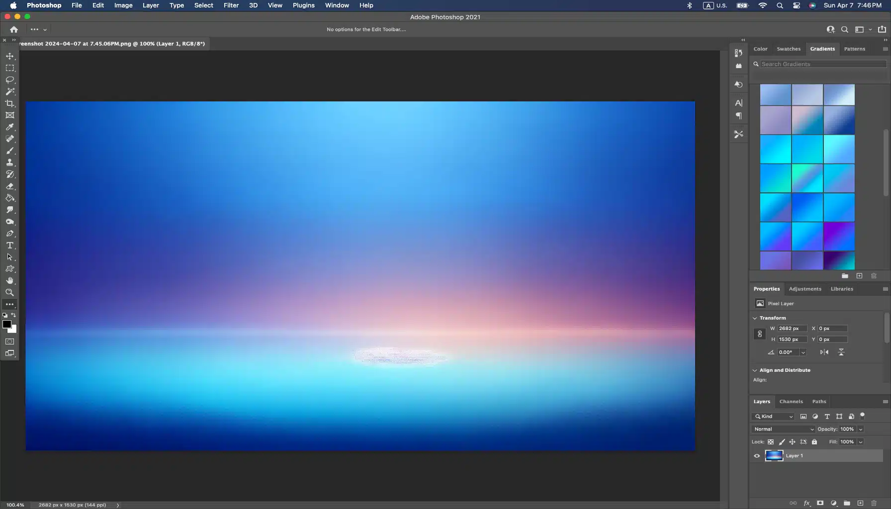
With a simple click, you can select from a plethora of gradient choices or even customize your own through the gradient panel and then use it as your not typical background.
The key to achieving smooth transitions between colors lies within the Gradient Editor. With this tool at your disposal, designing visually striking images becomes second nature.
Table of Contents
Mastering Gradient in Photoshop Techniques
Transcending the basics of this tool opens up a world of creative possibilities.
As we move beyond the fundamentals, we’ll explore advanced tactics that can transform your work from good to exceptional.
Understanding Gradient Editor in Photoshop
They serve as a pivotal element in digital art, offering a seamless transition between hues that can convey depth, dimension, and mood.
The key to mastering these tools lies not only in the mechanics of their creation but also in their strategic application.
Here are some steps to deepen your understanding:
- First, begin by experimenting with the tool, which is more than just a tool it's a playground for color blending.
- Then, explore beyond the predetermined sets by crafting custom color combinations. Remember, the tool allows you to reuse these in the future.
- Lastly, understand the impact of different opacity levels in gradient stops, which can create a more nuanced transition effect.
The Significance of Gradients in Photoshop for Digital Design
They are not just aesthetic enhancements; they can be functional design elements. They guide the viewer’s eye and can highlight or subdue parts of a design, like a Lightroom photo editor.
To truly leverage their use:
- First, use them to create focal points in your compositions. A radial gradient, for instance, can effectively spotlight a specific area.
- Then, employ them as background elements to give a sense of atmosphere or to achieve a tone for your design.
- Lastly, remember that they can also work as subtle textures, adding depth to flat designs without overwhelming the main content.
Gradient Types and Their Uses
Different gradient types serve different purposes in visual design. The linear gradient is straightforward and direct, while the radial gradient is more dynamic.
Here’s how to make the most of each type:
- First, for a clean and modern look, set in a linear gradient. It works well for backgrounds and can simulate light and shadow effectively.
- Then, radial gradients are perfect for generating a spotlight effect or mimicking natural light.
- Lastly, don't forget about angle gradients; they can create a sense of movement and are ideal for abstract or energetic designs.
Mastering these types is about understanding the subtle nuances that make your work stand out.
It’s about experimenting with color, transparency, and types to create visuals that not only look good but also communicate the right message.
Therefore, by exploring these advanced techniques, you’ll further your professionalism in regards to your digital designs.
Creating Custom Gradients in Photoshop
Gradients are more than just a blend of colors; they’re versatile tools that can bring depth and dimension to your designs.
As we’ve already covered their basics importance in digital design, let’s move forward.
Moreover, the focus now shifts to the practical application and creative manipulation within Photoshop to elevate your artwork.
Mixing Colors in the Gradient Editor
- First, open the tool by double-clicking on the gradient sample in the Options tab or through the Layer Style dialog.
- Second, inside the editor, click below the gradient preview to add color stops. Each stop represents a transition point for a new color addition.
- Then, select a stop and click the color swatch to open the Color Picker, where you can choose your desired hue.
- To refine the blend, move the stops closer for a sharp transition or further apart for a smooth gradient.
- Lastly, experiment with the opacity stops at the top of the gradient preview to control the clarity levels.
Adjusting Gradient Direction and Scale
- After applying your gradient, select the Move tool.
- With the Move tool active, drag the gradient to reposition it or pull the handles to change its direction and length.
- For more precise control, use the Gradient Fill dialog by selecting it from the New Fill or Adjustment Layer button at the bottom of the Layers panel.
- In the dialog, tune the Angle and Scale towards he direction and size of your gradient.
Therefore, regulating the direction and scale can dramatically alter the visual impact, so take the time to experiment with different settings, maybe even try a mobile photo editing.
Using Gradients in Photoshop for Textures and Backgrounds
- To create a textured look, layer multiple gradients with different blend modes.
- Use gradients with noise added from the Gradient Editor to produce a textured effect that adds depth to your backgrounds.
- For backgrounds, consider using large-scale gradients with subtle color changes to avoid distracting from the main content.
Gradients can be a subtle or striking addition to your design, whether used as a focal point or a complementary background.
Moreover, in the quest to make your designs stand out, it’s essential to keep exploring the myriad of possibilities that gradients offer.
While we’ve delved into some advanced techniques, there’s always more to discover.
For further reading on enhancing your design skills, explore our tutorial on selection tools in Photoshop.
Therefore, by mastering these techniques, you’ll be well on your way to designing custom gradients that can transform your designs from good to truly captivating.
Advanced Gradient in Photoshop Techniques and Effects
Transcending the basics of this blending modes tool opens a realm of creative possibilities. As we progress, we’ll delve into sophisticated techniques that can transform your digital artwork.
Our focus is going to extend to leveraging clarity, layering for intricate effects, and utilizing gradient maps for color fine-tuning.
Incorporating Transparency in Gradients in Photoshop
- First, begin by accessing the Gradient Editor through the Gradient Tool (G).
- Second, inside the editor, you'll find stops beneath the gradient bar. Click to add a new stop or select an existing one.
- Then, to adjust the transparency, alter the Opacity Stop above the gradient bar. Lowering the value will allowing underlying layers or images to show through.
- Lastly, experiment with different opacity levels at multiple spaces to achieve a smooth transition.
Overlaying Gradients in Photoshop for Complex Effects
- First, start with a base gradient on a new layer and change its blending mode to suit your design needs.
- Second, add another gradient layer on top and play with the blending modes Overlay, Multiply, or Screen are great beginner options.
- Then, adjust the opacity of the upper gradient layers to control the intensity of the effect.
- Lastly, use the Gradient Tool to shift the angle and scale of each layer, making up a dynamic interplay of hue.
Introduction to Gradient Map
Gradient mapping isn’t just about altering the overall color scheme of an image; it’s a powerful tool for precise tonal adjustments. When you start with this feature, you’ll discover it’s more than adding a splash of color, it’s about controlling the light and dark values within your composition.
Steps to Access Gradient Map in Photoshop
- Use the Adjustment Layer icon at the bottom of the Layers panel for non-destructive editing.
- Employ keyboard shortcuts to add gradient maps more efficiently.
- Save your custom maps for future use to maintain consistency across your projects.
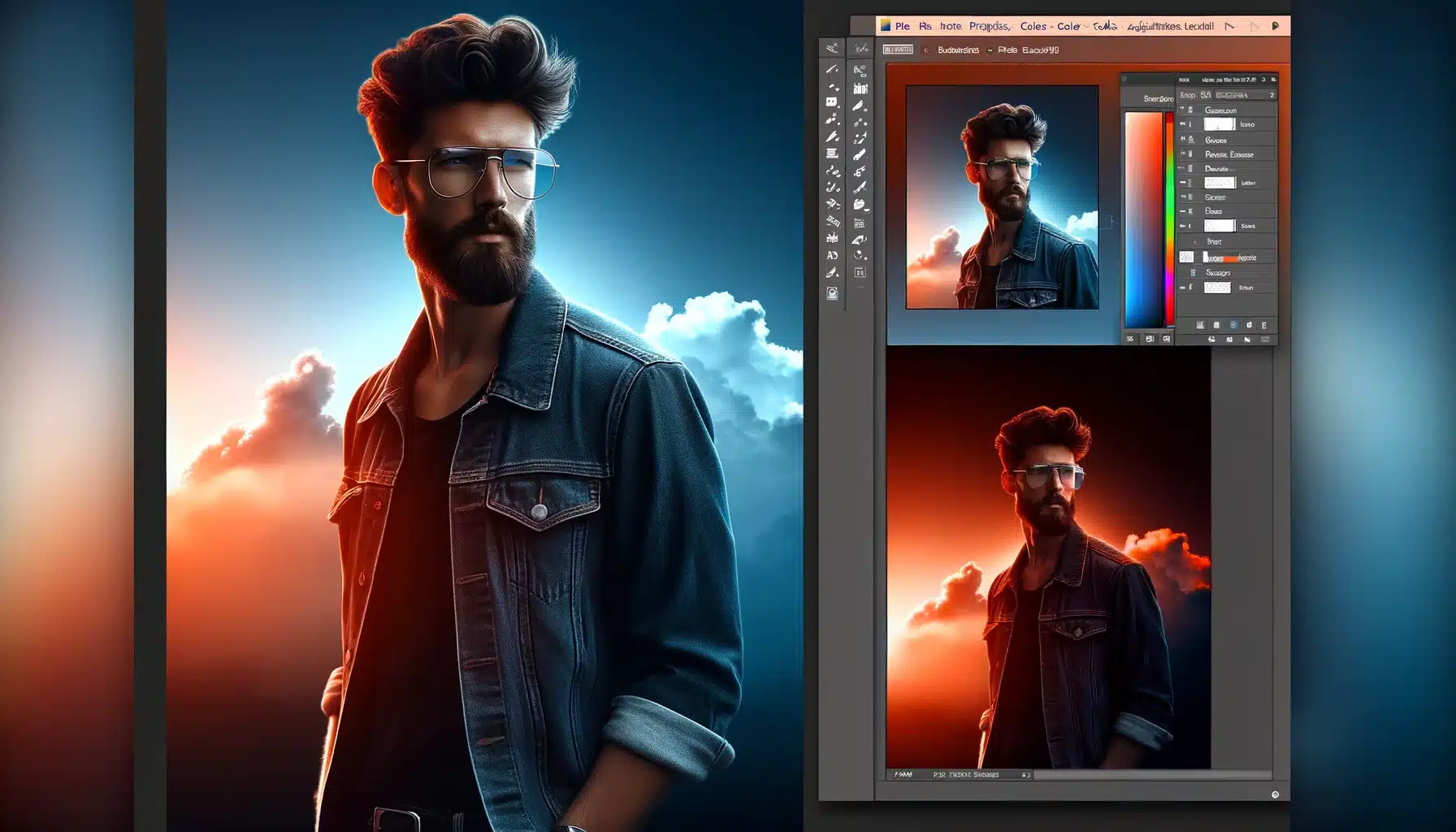
As we continue to build on our knowledge of gradient maps, let’s consider how they can be applied in more specific scenarios. For instance, when working with text portraits, a subtle gradient map can add warmth or coolness to skin tones, potentially complementing the subject’s features or the photo’s atmosphere.
In landscape photography, gradient maps can be used to simulate different times of the day. A gradient that transitions from a warm orange to a cool blue can mimic a sunset or sunrise effect, adding a dramatic element to your scenic shots.
For graphic design, gradient maps can be applied to create a cohesive color theme throughout your design elements. This can be particularly effective in branding or web design, where color consistency is paramount.
For further reading on enhancing your design skills, explore our tutorial on essential tools in Photoshop.
Creative Techniques with Gradient Maps

Transitioning from the basics of gradient maps in Photoshop, let’s explore the creative horizons this tool offers. It’s not just about regulating tones; gradient maps can be a powerful ally in crafting unique visual styles and correcting color with precision.
Gradient Maps for Color Correction
Gradient maps are powerful for color correction and achieving unique photographic effects:
- Add a Gradient Map adjustment layer from the Layers Panel.
- Choose a gradient preset or create your own that complements the tones in your photo.
- Adjust the blending mode of the Gradient Map layer; Soft Light is ideal for subtle corrections.
- Fine-tune the gradient colors and transition points to enhance or completely alter the mood of the image.
Advanced Gradient Map Applications
Blending Modes and Gradient Maps
- Start by adding a gradient map to your layer stack.
- With it being selected, explore different modes from the dropdown menu in the Layers panel.
- Overlay and Soft Light modes often yield subtle and nuanced color shifts, perfect for enhancing the mood of a photo.
- For a more dramatic effect, try functions like Multiply or Screen, which can deepen shadows or brighten highlights respectively.
- Remember to tweak the opacity to fine-tune the intensity of the effect.
Gradient Maps in Composite Work
- After combining your images, apply a gradient map over the entire composite.
- Use hues in your gradient that reflect the overall mood you want to convey.
- Modify the gradient map's opacity to allow the original colors of the composite to blend with the new tones.
- Use a layer mask to try the gradient map selectively, ensuring that each element in the composite benefits from the color grading.
Gradient Map Presets and Adjustments
- Access the gradient editor by double-clicking on the gradient map in the Layers panel.
- Explore the presets to find a base gradient that's close to your desired outcome.
- Customize the preset by moving the color stops, adding new ones, or changing the colors.
- Save your custom ones as new for future use.
- Alter the gradient map layer's blending mode and opacity to integrate the new colors into your picture seamlessly.
Practical Applications of Gradients in Photoshop

Enhancing Photographs with Gradients in Photoshop
Using gradients to improve photo aesthetics can be a subtle yet powerful technique. It’s not just about adding a splash of color; it’s about setting a mood.
For instance, a sunset gradient can warm up an image, giving it a golden-hour glow.
Here’s how you can do it:
- Open your photograph in Photoshop.
- Add a new gradient layer from the Layers menu.
- Choose a radiant preset that mimics the hue of a sunset.
- Modify the opacity to blend the gradient naturally with your photo.
- Use the gradient tool to drag from the corner of the picture to change the direction of the light.
Designing Web Elements
- Start with a rectangular shape using the shape tools.
- Put in a linear gradient from the gradient editor.
- Experiment with color stops to find a vibrant transition.
- Position the angle to match your website's design language.
- Save this style to your presets for consistent branding across your site.
Creative Uses in Graphic Design
Gradients aren’t just for backgrounds; they can be integral to the artwork itself.
Graphic designers often use them to craft visuals that are both eye-catching and meaningful.
For example, a gradient can suggest movement or focus in a composition. To harness this:
- Select the area where you want the gradient to appear.
- Use the gradient tool to apply your chosen colors.
- Play with blend modes to see how the gradient interacts with underlying layers.
- Regulate the scale and direction to perfect the visual flow.
In each of these applications, gradients serve as more than just decorative elements.
They are functional tools that can guide the viewer’s eye, convey mood, and emphasize important parts of the design.
If you’ve ever wanted to add a creative twist to your designs, understanding how to create gradient text effects in Photoshop could be the key. With Adobe Photoshop’s robust toolset at your disposal, it becomes easier than ever to create stunning images that truly stand out.
Photoshop offers an array of tools and functions for designing captivating effects. From selecting the right color layer gradients, adjusting opacity levels or even applying a certain fill – each step brings us closer to our desired effect.
The art of mastering these techniques lies within practice and experimenting. But fear not! As we progress further into this guide, we’ll provide detailed instructions on how best to use each tool and feature. Thus, ensuring optimal results while designing gradient texts in Photoshop.
Mastering Gradient Text Effects in Photoshop

Expanding your skill set in Adobe can significantly improve your design work, especially when it comes to styling. Gradients are a powerful tool that can transform plain works into eye-catching graphics.
This section is going to delve into advanced techniques and creative applications of effects that go beyond the basics.
By mastering these effects, you unlock endless possibilities for enhancing your design projects. We’ll explore techniques such as custom gradient creation, incorporating texture overlays, and utilizing layer blending functions to achieve stunning visual effects.
Additionally, we’ll cover practical tips for optimizing various output formats, ensuring your designs shine across print and digital platforms. With these skills honed, you’ll elevate your design work to new heights of creativity and professionalism.
Introduction to Gradient Text
Gradients can infuse your work with life, forming a dynamic that static shades cannot match. However, when you begin working with gradients, consider the visual impact you want to achieve.
Here are a few steps to guide you:
- Start by selecting your text with the Selection Tools in Photoshop. It’s essential to have a precise selection to ensure the gradient applies cleanly to your text.
- Next, explore the gradient editor to customize your color transitions. Mix and match hues to match the mood or theme of your project.
- Experiment with the blending modes. These can dramatically alter how the gradient merges with your base color, producing unique effects.
- Finally, tune the angle and scale of your gradient to perfect the direction and range of the color transition.
Unveiling the Significance of Gradient Effects in Visual Design
In the tapestry of visual design, gradients emerge as a dynamic tool, capable of imparting emotive resonance. Let’s delve deeper into the multifaceted importance of gradient effects:
- Guiding Viewer's Attention: Within the vast expanse of a design, gradients act as masterful storytellers. Thus, deftly guiding the viewer's gaze towards focal points of significance. Through strategic application, they draw attention to specific elements, leading the viewer on a journey of discovery and engagement.
- Emulating Realism: In the pursuit of realism, gradients reign supreme. They serve as the conduit through which natural light and color transitions are artfully replicated. From the gentle glow of dawn to the vibrant hues of a sunset, these changes evoke a sense of realism. A sense that breathes life into compositions, fostering a visceral connection with viewers.
- Versatility Personified: The beauty of gradients lies in their unparalleled versatility, capable of traversing the spectrum from subtle whispers to bold declarations. Whether employed as a gentle gradient wash or a striking color gradient, their adaptability knows no bounds. Thus, allowing designers to tailor their creations to suit any aesthetic vision.
- Strategic Branding Tool: Within the realm of branding, gradients emerge as strategic allies, instrumental in crafting a distinct visual identity. By infusing them with brand colors and motifs, organizations can forge a cohesive and unmistakable visual presence. A presence which leaves an indelible imprint on the collective consciousness of their audience.
- Creating Depth and Dimension: Gradients serve as the architect of depth within design, effortlessly transforming flat surfaces into dynamic, multidimensional landscapes. By seamlessly blending colors you imbue compositions with depth, inviting viewers to immerse themselves in the visual narrative.
Starting with Gradient Text in Photoshop
- Open your chosen picture and use the Quick Selection tool to isolate the area where you want to place your text.
- When it is in place, locate the gradient tool tools menu. If you’re looking for a specific gradient effect, you might want to add shapes in Photoshop as a layer beneath your work for added complexity.
- Apply your gradient by clicking and dragging across the text, watching as the colors blend and shift.
- Remember to save your work frequently, especially before making significant changes, to avoid losing your progress.
Incorporating these techniques into your workflow can elevate the visual quality of your designs. Remember to use them judiciously, as they should complement your work without overwhelming it. With practice, you’ll find that these effects can be a compelling component of your Photoshop repertoire.
By exploring these advanced tactics, you’ll be able to create text that not only stands out but also communicates your message in a visually engaging way.
Creating Text Layers for Gradient Application
- Navigate to Adobe Photoshop: Embark on your creative journey by opening your project in the illustrious realm of Adobe Photoshop. Within this digital sanctuary, your visions shall take shape and flourish.
- Unveil the 'Type Tool': Equip yourself with the indispensable 'Type Tool', a beacon of typographic prowess nestled within the toolbox. With its power at your fingertips, the picture becomes your playground, awaiting the imprint of your creative musings.
- Invoke Text Upon the Canvas: With a deft click upon the canvas, unleash the torrent of words swirling within your mind. Type your desired text, whether it be a poignant message, a bold proclamation, or a whimsical flourish. Let the letters weave a tale that transcends the confines of the digital realm.
- Singularize the Text Layer: As your textual masterpiece adorns the canvas, ensure its autonomy by isolating it onto its own layer. When selected, embrace the sanctity of individuality, segregating it from the cacophony of design elements that adorn your digital landscape. This segregation facilitates effortless modification, allowing for nuanced adjustments without disturbing the harmony of the entire composition.
This meticulous process lays the groundwork for a seamless gradient application. With each layer meticulously prepared, the picture becomes a tableau upon which gradients shall weave their magic. Further infusing your creations with a luminous vibrancy that captivates the senses and stirs the soul.
Selecting the Right Gradient
- Venturing into the Gradient World: Navigate through the labyrinthine expanse of Adobe to discover the fabled Gradient a sanctuary where colors converge flourish. Begin your quest by clicking on the gradient preview nestled within the Options tab, thus unlocking the portal to infinite chromatic possibilities.
- Exploring the Vast Repository of Presets: Traverse through this cornucopia of color gradients, such as the rainbow gradient, each a testament to the boundless creativity of the digital realm. Alternatively, forge your own path by crafting a bespoke gradient, manipulating color sliders with the finesse of a master painter.
- Delving into the Realm of Emotion and Expression: Beyond the realm of colors lies a deeper dimension—one governed by emotion and expression. As you embark on your journey, contemplate the profound question: What message do you wish to convey with your text? Whether it be a whisper of serenity, a burst of passion, or a dance of jubilation, select a gradient that resonates with the very essence of your creative vision.
- Heeding the Wisdom of Discernment: In the labyrinth of gradient selection, wisdom lies in discernment. Each gradient possesses a unique essence, capable of evoking specific emotions and drawing attention to your work with unparalleled magnetism. Thus, heed the wisdom of discernment as you peruse through the myriad options, for the right gradient possesses the power to transform your design into a visual masterpiece.
The Crucial Reminder:
As you navigate the vast seas of gradients, remember this crucial admonition: Choose wisely. For in the tapestry of design, the right gradient is not merely a choice but a beacon of illumination a conduit through which your message resonates with clarity and conviction.
In the symphony of design, the selection of the right gradient is akin to composing a masterpiece a delicate balance of colors, emotions, and expressions.
So, let your creative spirit soar as you embark on this odyssey, for within the realm of gradient selection lies the promise of infinite possibilities and boundless creativity.
Customizing Gradients for Text
- After selecting a gradient, click on the ‘Gradient Editor’ to modify it.
- Add or remove color sliders to introduce new hues or refine the transition between colors.
- Alter the location and opacity of the stops to control the flow and intensity of the gradient.
By fine-tuning these elements, you can create a gradient that complements your work and enhances your overall design.
Incorporating these techniques into your workflow will not only refine your skills but also elevate the quality of your design projects.
With practice, you can transform them from simple into captivating, gradient-filled typography that captures the attention of viewers and communicates your message with flair.
Enhancing Text Readability amidst Gradients
- Opacity Precision: Harness the power of opacity settings to delicately modify how the gradient interacts with your text. By fine-tuning opacity levels, you can strike the perfect balance between gradient allure and clarity. With this you are ensuring that your message shines through effortlessly.
- Strategic Gradient Stop Placement: The art of gradient design lies in meticulous stop placement. By judiciously modifying the location and spread of gradient stops, you can create a clear distinction between your work and its background. This strategic maneuver ensures that your work remains discernible amidst the gradient backdrop, captivating the viewer's attention without compromising readability.
- Subtle Enhancements: Sometimes, subtlety holds the key to clarity. Consider augmenting your work with a subtle drop shadow or stroke to define its edges against complex backgrounds. These understated enhancements provide a visual anchor, delineating text boundaries and bolstering readability amidst intricate gradients.
Achieving Harmony between Text Gradients and Images
- Color Cohesion: Draw inspiration from the picture itself when crafting your gradient, selecting colors that seamlessly blend with the picture palette. This approach fosters a sense of unity, ensuring that the gradient-filled work seamlessly integrates with the underlying imagery. Instead of the starkly contrasting against it.
- Alignment and Scale Adjustment: Pay heed to lighting nuances and contours within the picture when altering the angle and scale of your gradient. By aligning the gradient with the image's lighting and contours, you create a visual continuity. One that enhances the overall coherence of the design.
- Blending Mastery: Explore the myriad functions at your disposal to seamlessly integrate your words into the picture without sacrificing impact. Whether through subtle blending or bold juxtaposition, adept utilization of blending modes ensures that your work maintains its visual presence within the image. Thus, commanding attention without overpowering the composition.
By implementing these techniques, you not only safeguard text readability amidst its changes but also unlock the potential for seamless integration of written word and imagery. Thus, elevating your designs to new heights of aesthetic sophistication.
Saving and Reusing Custom Gradients
Once you’ve crafted the perfect gradient for your text, you’ll want to save it for future use. Here’s the process:
- In the Gradient Editor, after you’ve chosen your desired colors and opacity, click on the ‘New’ button to save your gradient.
- Name your gradient for easy identification, and it is going to appear in the Presets section of the Gradient Panel.
- To reuse a saved gradient, simply open the Gradient Panel, select your preset, and try it on new layers.
- Incorporating these techniques will not only add depth to your design but also save you time in future projects.
Remember, while the focus here is on maintaining the aesthetic appeal of your gradient text, it’s just as important to ensure that your content remains accessible and legible to your audience.
By following these advanced tips, you’ll be well on your way to designing visually stunning and professional-grade gradient texts.
Optimizing Gradients in Photoshop for Web and Print
Ensuring Color Consistency
When it comes to maintaining color consistency, the challenge lies in the differing ways devices display colors and the various color spaces used in web and print.
Therefore, here’s how to achieve uniformity:
- Work in a color-managed workflow: Start by calibrating your monitor and use consistent color profiles across all your devices.
- Understand color spaces: Use sRGB for the web to ensure the widest compatibility and CMYK for print to match the color production of printers.
- Soft-proof your colors: Use Photoshop's soft-proofing feature to preview how the changes you've made are going to look in different color spaces.
Gradient in Photoshop Limitations in Digital Media
Digital displays can sometimes present limitations with gradients, such as banding, where you see distinct bands instead of a smooth transition.
Moreover, to mitigate this:
- Add noise: A small amount of noise can break up the banding without being noticeable to the viewer.
- Increase bit depth: Working in a 16-bit setting can provide a smoother gradient as it allows for more colors.
- Be mindful of file formats: Choose file formats that support higher color depths, like PNG or TIFF, over those that are more compressed, like JPEG.
Preparing Gradients in Photoshop for Professional Printing
- First, use high-resolution settings: This is going to help keep the gradient smooth when printed.
- Then, avoid wide gradients: Large ones can lead to more noticeable banding in print, so keep them subtle.
- Lastly, consult with your printer: They can provide guidelines on how to construct your file to achieve the best results with their equipment.
Optimizing Gradients in Photoshop for Different Paper Types
Different paper types can affect how your gradient looks when printed.
For glossy paper, the chosen effects can appear smoother, while on matte paper, they may look more subdued.
Therefore, always run a test print on the paper type you plan to use for the final print.
Handling Gradient in Photoshop Overprints
When gradients overlap other elements in print, you may need to alter the overprint settings.
This ensures that the underlying colors interact correctly with the gradient, preventing unwanted color shifts or muddy results.
Moreover, incorporating these tactics ensures that your work is going to look its best, whether viewed on a screen or printed on paper.
Embrace Visual Aids
Incorporating the tools at your disposal into your workflow heralds a new era of creative exploration and expression. With its array of features at your disposal, you possess the tools to transcend convention and breathe life into your designs.
Unleash your imagination, experiment boldly, and let the Gradient be your guiding light on the path to artistic innovation.
Adjusting Gradient Direction and Scale
- Select your text layer and click on the ‘Gradient Overlay’ in the ‘Layer Style’ dialog box.
- To change the direction, simply click and drag within the picture to set the angle of the gradient.
- For scaling, regulate the ‘Scale’ slider in the ‘Gradient Overlay’ dialog box to increase or decrease the size of the gradient effect.
- Preview the changes in real-time and fine-tune them to suit your design needs.
Adding Multiple Gradients to Text
- Duplicating the text layer and applying a different gradient to each layer.
- Utilize blending modes to blend the layers together for a unique effect.
- Play with the opacity of each layer to allow interaction in visually engaging ways.
- Position the layers strategically to highlight certain parts of your work or to create a sense of depth.
- A graphic showcasing text with multiple gradient layers overlaid could be a valuable addition here.
Incorporating these advanced techniques into your workflow will not only improve the aesthetics of your work but also give you a competitive edge in the realm of digital design.
Remember, the key to mastering these advanced techniques is practice and experimentation. With each project, you’ll find new ways to implement these strategies, making your text stand out in the vast world of digital art and design.
Frequently Asked Questions

How do you create a gradient in Photoshop?
-
To create a gradient in Photoshop, first, open the program and select the Gradient Tool, which might be found under the Paint Bucket Tool if it's not immediately visible. You can activate the Gradient Tool by pressing 'G' on your keyboard. Once selected, look at the top options bar and click on the gradient preview box. This action will open the Gradient Editor where you can select from existing gradients or create a new one by adjusting the color stops along the gradient bar.
Where do I put gradients in Photoshop?
-
Gradients can be placed in various locations within Photoshop depending on what you want to achieve with your project.
You might apply a gradient directly to a layer to serve as a background, or use it on a layer mask to blend two images seamlessly. Gradients are also useful in adjustment layers for color correction or visual effects.
Where is the gradient editor in Photoshop?
-
The Gradient Editor in Photoshop is accessed through the Gradient Tool. After selecting the Gradient Tool, click on the gradient sample in the top options bar.
This will open the Gradient Editor, allowing you to modify existing gradients or create new ones. Here, you can adjust the direction, colors, and transitions of the gradient to suit your needs.
How to do a gradient fade in Photoshop?
-
To perform a gradient fade in Photoshop, you typically use a layer mask. First, add a layer mask to the layer you wish to fade.
Then, select the Gradient Tool and choose a gradient that transitions from a color to transparency, or from black to white if you're working on the mask.
Click and drag the gradient across the area of the image where you want the fade effect to appear. The direction and length of your drag will affect the spread and softness of the fade effect.

Conclusion
Mastering gradients in Photoshop has been a game-changer for my digital artwork. Personally, the moment I began to truly explore the Gradient , my designs transformed dramatically.
I remember working on a piece where the sky just wasn’t conveying the right time of day.
By altering the opacity and color stops within a custom gradient, I created a twilight effect that perfectly captured the mood I was aiming for, adding a layer of depth that flat colors could never achieve.
This hands-on experimentation and the results it yielded convinced me of the power that lies in mastering this tool.
For those inspired to elevate their design skills and explore the vast creative possibilities Photoshop and Lightroom offer, I highly recommend diving into comprehensive learning.
Our courses are tailored to guide you through every nuance of these powerful software tools, whether you’re refining your technique with gradients or exploring other advanced features.
Embark on your journey to mastering digital editing and design by enrolling in our Photoshop Course and Lightroom Course.
Transform your creative ideas into stunning realities and discover the endless possibilities that professional proficiency in Photoshop and Lightroom can offer.
Read more about Photoshop: