In this typo portrait tutorial in Photoshop, I’ll guide you through making captivating and unique text-based portraits using Photoshop and Lightroom.
Imagine turning your favorite images into stunning works of art that blend photography and typography seamlessly.
This Photoshop tutorial is designed to grab your attention, spark your interest, and inspire you to take action.
By the end, you’ll be equipped with the techniques needed to transform ordinary photos into extraordinary visual stories.
Let’s dive in and unlock your creative potential!
Table of Contents
Getting Started with Adobe Photoshop
Adobe Photoshop offers a versatile platform for creative projects. Let’s begin this typo portrait tutorial by setting up your workspace for a smooth editing experience.
Setting Up Your Workspace
When you open Photoshop, the first thing you see is your workspace.
Take a moment to arrange it to your liking. Click on "Window" in the top menu, and select or deselect panels.
For a balanced workspace, I recommend having the toolbar on the left and essential panels like Layers, Properties, and Adjustments on the right.
When preparing for your typo portrait tutorial, don’t forget to include Photoshop actions in your setup.
These actions can streamline your workflow and ensure consistent results throughout your project.
Essential Tools and Panels
The taskbar on the left houses your main tools. You will use these to create and edit images.
The move tool, selection tools, brush tool, and text tool are some you will often use.
Don't forget to familiarize yourself with the options panel at the top. It changes depending on the tool you select.
The marquee tool is excellent for making precise selections and isolating areas of your image. Mastering its use will greatly enhance your editing efficiency.
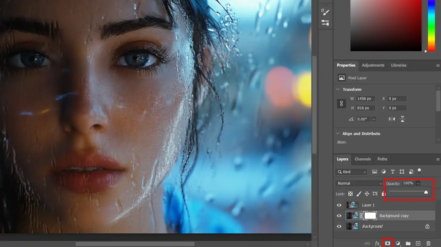
Understanding the Layers Panel
The Layers panel is your best friend in Photoshop. It helps you manage different layer of your image separately.
To create a layer mask, click on the 'Add layer mask' icon at the bottom of the Layers panel.
Use the opacity slider to make a layer more or less transparent.
Typo Portrait Tutorial: Create a Typographic Portrait
Now that your workspace is ready, let’s begin crafting a typographic portrait in Photoshop for this typo portrait tutorial.
We will use various features and panels we just discussed.
First, open your image in Photoshop. If it has a white or dark background, don’t worry; we will work through it.
Press Ctrl + Shift + Nto create a new layer. This is where we will add a text layer.
Select the text tool, choose a font you like, and start typing text that describe your portrait.
Place each text layer over the outline of the portrait.
Change the size and direction of the text to fit better around the image.
Adding a Layer Mask and Applying the Displacement Map
Select the image layer and duplicate it press Ctrl + J. Move this duplicated layer above the text layers.
Add a layer mask to this duplicated layer.
With the mask selected, use the brush tool to paint over areas you wish to reveal the text beneath.
Create a displacement map to add texture. First, convert your working document to grayscale and save it as a PSD file.
Return to your original one, select the displace option from the filter dropdown menu, and apply it using the saved PSD file.
Adjust blend mode and opacity of the top layer to fine-tune the final look.
Creating the Base Image and Selecting the Right Picture for Your Typo Portrait Tutorial
To start your typographic portrait tutorial, you’ll first need a strong foundation.
Let’s begin by selecting the perfect photo for our base image.
Before diving into the world of Adobe Photoshop, we need the right picture for this tutorial.
A clear and well-lit portrait with a suitable background works best for a typo portrait tutorial. Make sure the picture has enough contrast between the subject and the portrait background.
A portrait with sharp edges allows for better words placement.
Also, when choosing the right picture for your typographic portrait in Photoshop, consider a black background, as it provides a striking contrast that can create the text elements stand out more clearly.
To build a compelling base image for your typo portrait tutorial, explore various portrait ideas for photography that align with your vision.
Choose a picture that offers strong composition and lighting to ensure your final design stands out.
Using a portrait filter can also help enhance facial features and create a polished base picture for your project.
Preparing Your Image
Once you have your picture, open it in Photoshop.
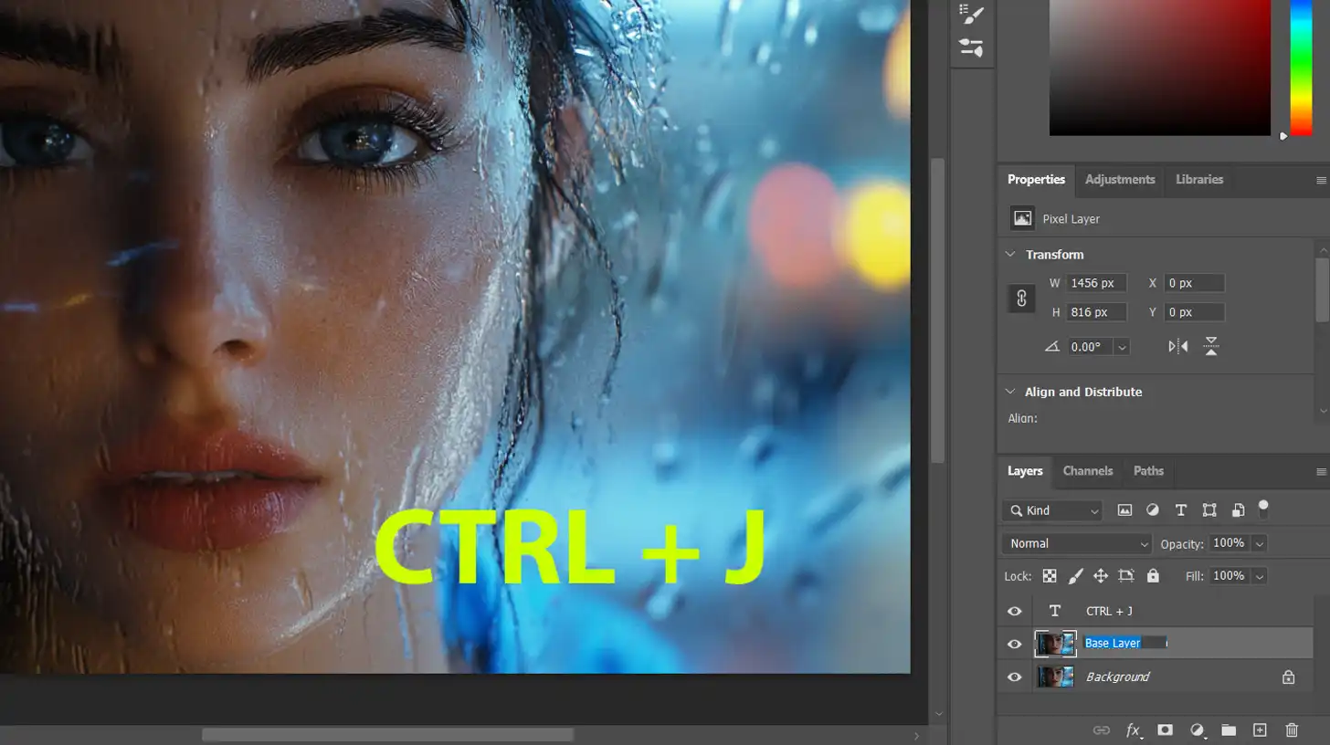
The first step in this typo portrait tutorial is to create a copy of the image layer. This ensures that your original remains untouched. Follow these steps:
Press Ctrl + J to duplicate the layer. Now you have your backup.
Name this new layer "Base Layer" by double-clicking on the layer name, or simply right-click and choose "Rename Layer" to label it accordingly.
Adjusting Brightness and Contrast in
Next, we will adjust the brightness and contrast to make the subject more prominent against the background. Follow these steps:
Go to the top dropdown menu and select Image > Adjustments > Brightness/Contrast.
Use the sliders to tweak the brightness and contrast until the subject stands out clearly from the background.
This adjustment will help in making your typographic portrait in Photoshop pop.
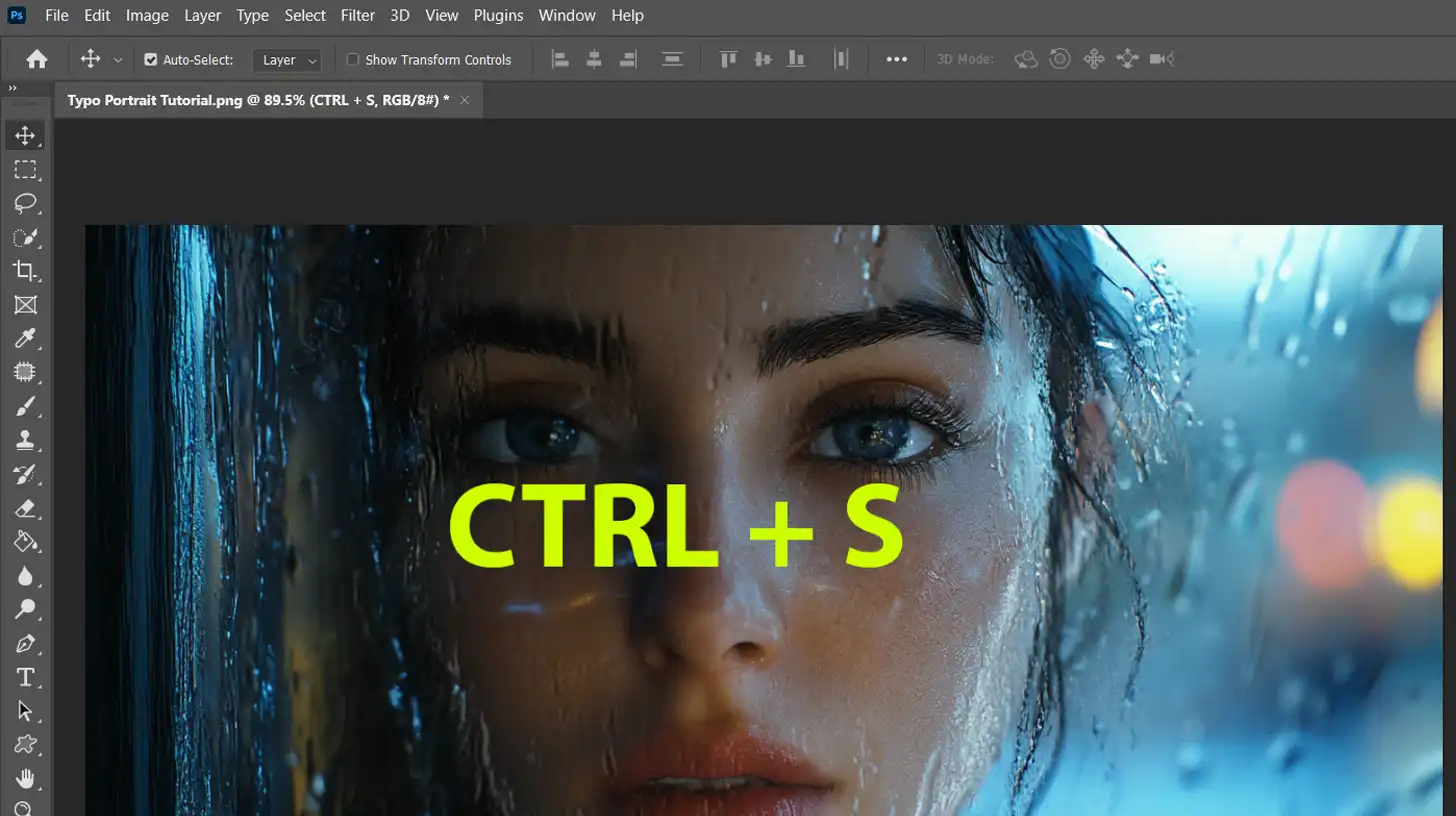
Pro Tip: Press Ctrl + S to save your progress regularly to avoid any loss of work.
Additional Tips for the Typo Portrait Tutorial
For a more refined look in this typo portrait tutorial, consider using the content-aware fill in Photoshop to remove any unwanted elements from the background.
Additionally, mastering Photoshop shortcuts can significantly speed up your workflow and make the editing process smoother, especially when dealing with background adjustments.
When working on your typo portrait tutorial, consider the strengths of Photoshop vs. Illustrator. Photoshop is great for detailed photo manipulation, while Illustrator excels in creating clean, scalable text and vector elements.
Before deciding which software to use for your typo portrait tutorial, it’s essential to understand the strengths and differences between Photoshop and Illustrator.
The following table provides a quick comparison to help you choose the best tool for your project:
Adding Text to Your Portrait in the Typo Portrait Tutorial
When adding text to your portrait in this typo portrait tutorial, selecting the right font is a critical step.
The font you choose will greatly influence the overall feel and impact of your design. Let’s explore how to make the best choice.
Selecting the Right Font
Choosing the right one is significant in making your typography portrait tutorial come alive.
Browse through the various options available in the Adobe Photoshop dropdown menu.
Select text styles that complement the features of your picture. Remember, the typography should enhance, not distract from your subject.
Placing Text on the Image
Now, let’s get to the fun part placing the text on the image:
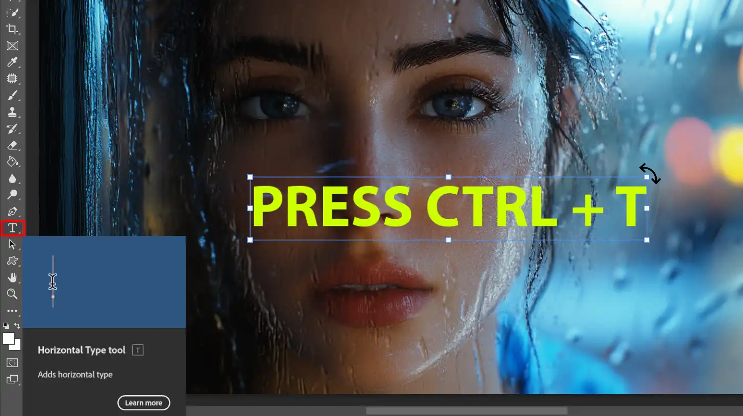
Select the text tool from the toolbar.
Click on the area where you want your first word to go.
Type in a word or phrase that describes your portrait in Photoshop.
Continue this process, adding more words around the image.
Change the size and orientation of each text layer to fit better.
Press Ctrl + T to transform the text layer, allowing it to curve or bend along the edge of the portrait.
Layer Masking for Text Effects in Photoshop
This step will add some flair to your typographic portrait:
Create a new layer mask by pressing the 'Add a layer mask' icon.
With the mask selected, choose a brush tool.
Paint over areas of the text layer to hide or reveal parts of the text, creating a blending effect.
For a unique look, try using a displacement map:
Save a grayscale copy of your picture as a PSD.
Go to Filter in the top dropdown menu, select Distort, and then Displace.
Apply the saved PSD. This creates a ripple effect, making your text look like it's part of the picture.
Pro Tip:Group your layers in Photoshop for better organization, select and then simply right-click them, and choose ‘Group from Layers.’ This keeps everything neat and accessible.
Additionally, to achieve a stunning metallic effect to text, use layer masking to blend textures and colors seamlessly, enhancing the depth and shine of your design.
Final Touches and Adjustments in the Typo Portrait Tutorial
You’ve come a long way in this typo portrait tutorial, but we’re not done yet.
Refining your typography portrait is necessary.
Refining the Typography Portrait
In this typo portrait tutorial, notice how the text layer blends seamlessly with the picture.
Adjust the opacity and size of the text layer if needed. You might want to tweak the text placement.
Click on a text layer and press Ctrl + T to transform it. Ensure everything looks cohesive. If any word looks out of place, don’t hesitate to move or resize it.
Color Correction and Filters
Let’s add some final color touches:
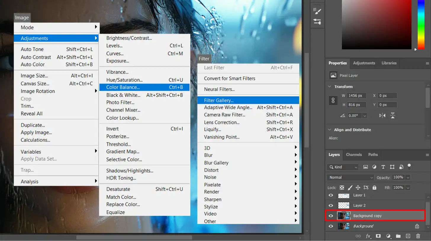
Select the topmost layer from the layers panel and go to the dropdown menu.
Choose Image > Adjustments > Color Balance. Play with the sliders to find the perfect balance.
Apply filters for an artistic touch. Go to Filter > Filter Gallery and choose one. This gives a distinctive flair to your picture in Photoshop.
Pro Tip: Small mistakes can be fixed easily, ensuring a polished final product.
Saving and Exporting Your Artwork: Tips for Your Typo Portrait Tutorial
Alright, folks, you’ve done all the hard work.
Let’s make sure you save and export your art correctly for your typo portrait tutorial.
You want to keep it snazzy and, most importantly, intact. Trust me, you don’t want to lose any of your precious components.
Saving Your Project
First, always save your project as a PSD. Why? It keeps all your elements, adjustments, and effects editable. Doesn’t that sound useful?
Follow these steps
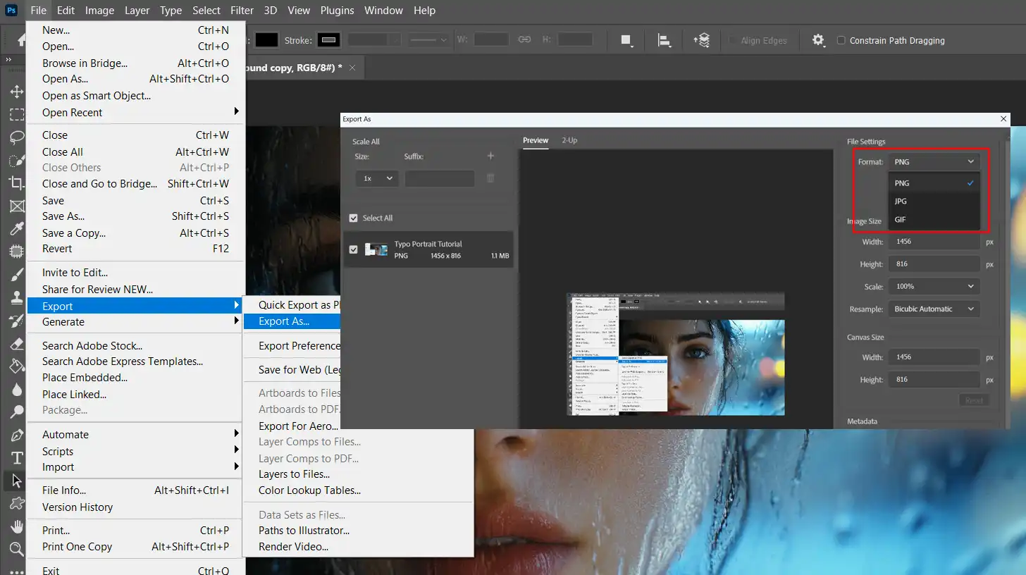
Go to File > Save As in the top dropdown menu.
Select Photoshop (PSD) as the wanted format.
Click Save or Press Ctrl + S. Now, take a deep breath, you’ve got a backup.
Exporting for Web and Print
Now, let’s talk exporting. This step turns your layer into a single, viewable picture.
Export for Web
Navigate to File > Export > Export As.
Choose JPEG or PNG as your format.
Adjust the quality settings. Less compression means better quality but larger size.
Export for Print
Use File > Save As again and select TIFF.
TIFF files preserve quality, perfect for printing.
Last-Minute Touches for Your Typo Portrait Tutorial
Before you hit ‘save’ for the last time, press Ctrl + S to do a final check.
Ensure no hidden layers are lingering around and that all necessary layers are visible.
Double-check the flattened picture to ensure nothing’s missing.
Your aim is a polished, professional-looking output. Make sure the color balance and alignment look spot-on.
Pro Tip: Always zoom in and out to catch any imperfections. This simple step can save you from headaches later!
Before finalizing your typo portrait, make sure to apply those last-minute touches to edit portraits, refining details and enhancing the overall look to achieve a polished finish.
Use Lightroom to apply last-minute touches and essential tools in Lightroom to fine-tune colors and contrast for a polished, professional artwork portrait tutorial
Common Photo Editing Mistakes and How to Avoid Them
Creating your masterpiece in Photoshop for your typo portrait tutorial can often feel like assembling a jigsaw puzzle without seeing the picture on the box.
You make one wrong move, and poof!
Your efforts may seem wasted. But fear not! I’m here to point out some common blunders you might encounter and how to sidestep them.
Overlooking Layer Masking
Then, there is Photoshop masking in your typo portrait tutorial. I can’t stress this enough: layer masks are your friends.
They allow non-destructive editing. Want to hide or reveal parts of your picture without erasing them?
This is your tool. Always use them instead of the eraser tool to maintain full control over your edits.
Forgetting to Save Frequently
Imagine working on a picture in Photoshop for hours, only to lose it all because you didn’t save.
Press Ctrl + S to save your work. Make it a habit to save work regularly.
This counts double when created complex pieces like typography portraits, where you constantly tweak different elements.
Misusing Text Layers
These components are critical, especially for typography portraits.
It’s easy to get carried away and add every word in one giant text box. Don’t do that. Instead, create individual text layer for each word or phrase.
This way, you move and resize them independently, positioning them to perfection.
Inconsistent Fonts and Colors
To create a harmonious look means choosing typography and colors that complement each other.
Mix too many, and it starts looking like a circus. Stick to a few text styles and a cohesive color palette.
This keeps your design clean and professional.
Ignoring Image Resolution
Always start with a high-resolution image.
Low-resolution images look pixelated and unprofessional, especially when printed. Make sure your starting image has enough resolution to work with.
Trust me, you don’t want to complete your art only to find out it looks blurry.
Using Wrong File Formats
Lastly, know your document formats. Save your working document as PSD to keep your layer intact.
When it’s time to share or print, export it as RAW or JPEG for online use, or TIFF for high-quality prints.
This ensures you maintain the quality of your artwork.
Pro Tip: Experiment with the displacement map to add texture to your typography portrait. It’s a game-changer in making your text blend seamlessly with the image.
Tips and Tricks for Better Typo Portrait Tutorial
So, you’ve dived into the world of typographic portraits. But let’s make sure you avoid common pitfalls. Here are a few mistakes I’ve noticed over the years.
Avoiding Clutter: Separating Your Text Elements
A single text layer won’t cut it. Create an individual text layer for each word or phrase.
This gives the text better control.
Not Using Layer Masks
Instead of erasing, use layer masks.
They allow non-destructive edits, letting you hide or reveal parts without changing the original image.
Forgetting to Press Ctrl + S
Save your work frequently. Press Ctrl + S is your best friend, especially in complex projects.
Low Resolution
Always start with a high-resolution image.
Low-resolution images can look pixelated and unprofessional.
Advanced Techniques and Effects
Now, let’s elevate your typographic portraits from good to great.
Navigate to Filter > Filter Gallery and see which ones fit your style.
Repeat Edge Pixels
For a seamless background, use the ‘repeat edge pixels‘ option in certain effects to ensure the pixel dimension aligns perfectly, smoothing out any edges.
Use Layer Masks for Blending
Apply layer masks to blend your text seamlessly with the image. This avoids harsh edges.
Pro Tip: Remember, practice makes perfect. Follow these tips, explore tutorials on how to use essential tools in Photoshop, and you’ll master the art of typographic portraits!
Frequently Asked Questions
What’s the process for creating a text portrait effect?
$2,061.00Original price was: $2,061.00.$1,061.00Current price is: $1,061.00. 27584
Download Your Free Guide Now!
Discover the secrets of photography with our printable guide! Master essential techniques like aperture, shutter speed, and ISO to create stunning images. Get your free printable PDF now and start turning your snapshots into masterpieces!