Add Stroke to a Text in Photoshop: Boost Your Designs
Add Stroke to a Text in Photoshop: Boost Your Designs
Looking to add a stroke to text in Photoshop? You’re in the right place.
In this guide, I’ll walk you through the steps to make your text stand out with a crisp outline.
Whether you’re designing a poster, a social media graphic, or a digital art piece, knowing how to add an outline text in Photoshop can elevate your work.
Follow along, experiment with different settings, and soon you’ll master this useful technique. Ready to transform your text? Let’s dive in!
Table of Contents
Detailed Instructions on How to Add Stroke to Text Photoshop
In Photoshop, adding a stroke to text is a powerful way to expand its visual impact.
After typing your text using the type tool, you can easily select stroke options in the Layer Style dialog box to create a stroke outline
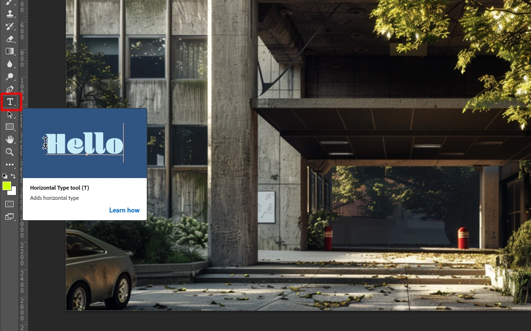
1. Open Your Document
Fire up Photoshop and create a new document.
Grab the Type Tool and type your text.
2. Type Your Text
Type your text with your favorite fonts and sizes.
Make sure the text layer styles are selected in the Layers Panel.
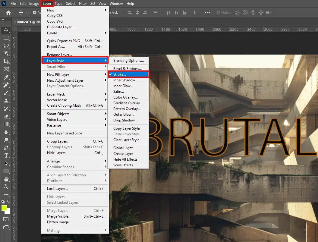
3. Open Layer Styles
Right-click on your text layer and select “Blending Options”.
This opens the Layer Style dialog box for adding effects.
4. Select Stroke For Your Outline Text
In the Layer Style dialog box, check the Stroke option to outline text with a stroke outline.
You can select stroke, choose outlined text, set it to the same color as your text, or opt for a solid color.
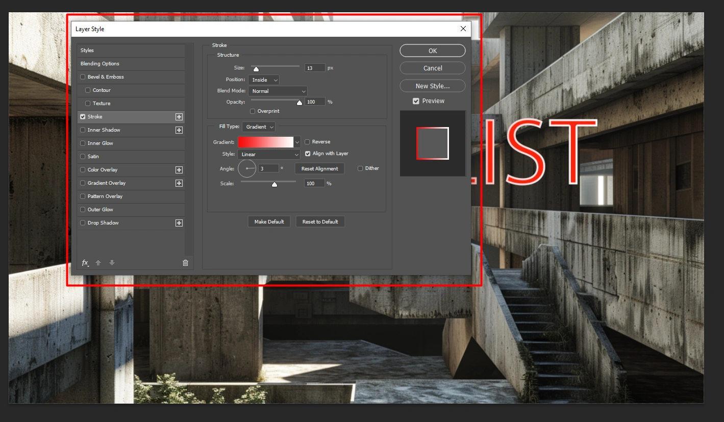
5. Adjust Stroke Settings
Set the stroke width for the outline thickness.
Choose the stroke position: outside, inside, or center.
Select the stroke color using the Color Picker.
6. Fine-Tuning
Select and play around with different stroke options.
You can add several strokes for a more interesting look.
Apply the Outline Text Effect
Once you’re happy, click “OK” to apply the stroke.
Your outline text should now have a nice outline.
Polishing and Exporting Your Design
Once satisfied, replace settings to refine the stroke’s appearance.
For detailed guidance, access screenshot examples or images online to see how professionals apply the same text effect in their work.
Save your project as a Photoshop file to preserve your design layers for future edits.
Pro Tip: Combine lines with shadows or other effects for a more dynamic look.
For more advanced text manipulation techniques, you can learn more about how to warp text.
For more advanced techniques and tips on achieving clear and focused images, consider using the content-aware fill in Photoshop to seamlessly blend your outline text with the background.
Also, mastering Photoshop shortcuts can significantly speed up your workflow
Tips and Tricks for Perfect Stroke
To achieve and highlight the ideal stroke effect, it’s crucial to select the appropriatesize.
Next, we’ll explore how to choose the right stroke size for your design
Choosing the Right Stroke Size
Modify stroke size based on your design. Small lines add a bit of emphasis, while big lines grab attention.
Find the balance that fits your project.
Try different sizes and notice how they change your design.
Adjust until it looks good.
Don't rush; take your time.
Testing Different Stroke Colors
Adjust the thickness and scale of the stroke to fit your design needs.
Experiment with two colors using the color picker for the lines to achieve even interesting painting effects, ensuring they match or contrast with your outline text.
Color techniques are significant in creating striking visuals. Utilizing the color picker for stroke colors can elevate your designs, making them more dynamic.
Use the type tool to adjust your outline text and apply corner settings to round or sharpen the stroke’s edges, depending on your preference.
Important Considerations:
Stroke color matters.
It can blend in or stand out. Test different colors and see how they look with your background.
Contrast helps.
Use the color wheel.
Complementary colors make the lines pop.
Analogous colors create harmony.
Always test before deciding.
Using Multiple Strokes
Strokes add depth. Layer them carefully. Different sizes and colors can create cool effects. Don’t overcrowd your design.
Mastering Size and Color for Stroke Effects in Photoshop:
Adding strokes to text in Photoshop is a versatile technique that can significantly highlight your designs, whether you’re creating posters, social media graphics, or digital art pieces.
Mastering the size and color of lines allows you to achieve professional-looking results that make your text stand out effectively.
Aspect
Overview
Steps Overview
Step-by-step guide to adding strokes to text in Photoshop.
Initial Setup
Starting Photoshop, creating a new document, and using the Type Tool.
Adding Stroke
Instructions on accessing Layer Styles, selecting Stroke, and adjusting settings like width, position, and color.
Fine-Tuning Options
Details on refining stroke appearance and experimenting with different stroke options.
Advanced Techniques
Tips on combining brushstrokes with other effects like shadows for enhanced visuals.
Pro Tips
Expert advice on optimizing workflow and utilizing additional Photoshop tools.
Common Mistakes
Pitfalls to avoid when applying brushstrokes to text, ensuring clarity and readability.
FAQs
Answers to common questions such as showing only the stroke of text, adding several brushstrokes , and applying effects to text in Photoshop.
Determining the Best Stroke Options for Your Design
When adding a stroke to text, selecting the appropriate stroke size is important to achieving the desired visual impact. Here’s how you can make the most of this aspect:
Purposeful Emphasis: The stroke size determines how much emphasis your text receives. Smaller brushstrokes add subtle emphasis, while larger strokes can make text stand out prominently.
Testing and Adjusting: Experiment with different stroke sizes to find the perfect balance for your design. Consider the overall composition and ensure that the stroke complements rather than overwhelms the text.
Visual Impact: Visualize how different stroke sizes affect the overall look of your text. Sometimes a slight adjustment in stroke size can significantly alter the perception of your design.
Experimenting with Stroke Colors In The Text Layer
Stroke color plays an important role in defining the appearance of your text and how it interacts with the background. Here’s how you can leverage stroke colors effectively:
Color Dynamics: Explore a variety of colors to achieve the right level of contrast and visual impact. The stroke colors should complement the text and background colors to create a harmonious composition.
Color Harmony: Utilize color theory principles such as complementary or analogous colors to ensure that the stroke enhances rather than detracts from your design. Test different color combinations to see which ones make your text stands out the most.
Practical Tips: Test combinations of stroke colors to find the perfect match for your design. Consider the mood and message you want to convey with your text and adjust the stroke colors accordingly.
Advanced Text Effects: Layering in the Layer Style Dialog Box
As you delve deeper into text effects in Photoshop, mastering advanced techniques such as layering brushstrokes and avoiding common mistakes becomes significant for creating polished designs.
Layering Multiple strokes
Layering more than one stroke on text using different layer styles can add depth and complexity to your design, making it more visually engaging. Here’s how you can effectively layer brushstrokes:
Creating Depth: Experiment with layering brushstrokes of different sizes and colors to create a sense of depth in your text. This technique can make your text in photoshop appear more three-dimensional and dynamic.
Strategic Application: Apply more than one stroke judiciously to avoid clutter and maintain clarity in your design. Each stroke should enhance the overall composition without overwhelming the text or other design elements.
Effect Variations: Explore various combinations of brushstrokes layers to discover unique design effects. Sometimes subtle changes in strokes positioning or the text color can make a significant difference in the visual impact of your text.
Common Mistakes to Avoid
Mistakes in handling stroke effects can detract from your design’s impact and clarity. Here’s how to steer clear of common mistakes:
Avoiding Common Mistakes
While brushstrokes can enhance text, they can also detract from its readability and overall effectiveness if not used properly. Here are some common mistakes to avoid when applying brushstrokes to text in Photoshop:
Managing Stroke Usage: Use brushstrokes sparingly to avoid clutter and maintain clarity in your design. Each stroke should serve a purpose and contribute positively to the overall composition.
Prioritizing Readability: Ensure that strokes do not obscure or make the text difficult to read. Choose brushstrokes for the text color and sizes that enhance readability and make the text stands out effectively.
Workflow Optimization: Streamline your workflow by using Photoshop's layer styles effectively. Utilize techniques such as converting text layers to smart objects before applying brushstrokes to maintain flexibility and control over your design.
By mastering these advanced techniques and avoiding common pitfalls, you can elevate your text effects in Photoshop and create professional-quality designs that captivate and engage your audience effectively.
Overusing Stroke Effects
Overloading your design with brushstrokes can clutter your project and diminish its visual appeal, this might happen sometimes when you use text effects in your portrait designs.
He is some tips on how to do it effectively :
Enhancement vs. Overpowering: Strokes should enhance your text or graphics, not overwhelm them. Use them sparingly to maintain a balanced composition.
Monitoring Impact: Each stroke alters your design's appearance. Carefully observe how each addition affects the overall look and feel of your project.
Ignoring Text Readability
The readability of your text is paramount. Ensure that strokes do not obscure or make your outlined text box difficult to read:
Contrast Considerations: Choose brushstrokes colors that provide sufficient contrast against the background to ensure readability.
Fonts Selection: Opt for fonts that are clear and legible, avoiding excessively decorative or overly small options.
Testing Across Devices: Verify readability on different devices and screen sizes to ensure your message reaches your audience effectively.
Not Saving Your Work
Failing to save your work can lead to frustration and loss of valuable time invested in your design:
Saving Practices: Adopt proactive saving habits such as saving early and frequently to safeguard against unexpected software crashes or power outages.
Automated Backup: Utilize Photoshop and Lightroom's automatic saving and backup features to prevent data loss and protect your work-in-progress.
Proactive Measures: Set reminders or use timers to prompt regular saving intervals, providing peace of mind and security for your creative projects.
By avoiding these common mistakes and implementing these strategies, you can enhance your workflow efficiency and produce polished designs that resonate with your audience.
This version expands on the common mistakes to avoid when using stroke effects in Photoshop, providing detailed strategies for maintaining design clarity and efficiency.
Frequently Asked Questions (FAQs)
What are the steps to show only the stroke of text in Photoshop?
First, create your text layer in Photoshop.
Go to the "Layers" panel, right-click on the text layer, and select 'Blending Options.'
In the Layer Style dialog box, click on 'Stroke' and adjust the size and color as desired.
To hide the original text and only show the stroke, set the 'Fill' opacity of the text layer to 0%.
What are the steps to add a stroke path in Photoshop?
Select the Pen tool or any shape tool and create your path.
Once your path is created, right-click on it and choose 'Stroke Path.'
A dialog box will appear where you can choose the tool to stroke the path. Select 'Brush' and click 'OK.'
To see the stroke, ensure your brush settings are adjusted before stroking the path.
How do I add several brushstrokes to text in Photoshop?
Start by adding a stroke to your text using the Layer Style dialog box as described above.
To add another stroke, you’ll need to use a workaround since Photoshop does not support more than onestrokes directly.
Right-click on your text layer, select 'Convert to Smart Object.'
Now apply a new stroke by going to Layer Style > Stroke.
Repeat the process of converting to Smart Object and applying a new stroke for additional brushstrokes.
What are the steps to add effects to text in Photoshop?
Click on your text layer to select it.
Go to the 'Layer' menu, hover over 'Layer Style,' and select 'Blending Options.'
Here you can explore various effects such as Drop Shadow, Outer Glow, Bevel & Emboss, etc.
Select an effect to apply and adjust the settings as needed to achieve your desired look.
In conclusion, adding a stroke to text in Photoshop is a simple yet effective way to make your designs pop.
Whether you’re working on posters, social media graphics, or digital art, this technique ensures your text stands out.
By following the steps outlined, you can easily add and customize strokes to fit your design needs.
Don’t forget to experiment with different stroke sizes and colors to find what works best for your project.
Personally, I’ve found that using strokes has greatly improved the readability and visual appeal of my text in various designs.
It’s a versatile tool that can be combined with other effects like shadows to create a more dynamic look.
For those looking to delve deeper, I highly recommend my Photoshop course. And if you’re interested in enhancing your photo editing, check out my Lightroom course.
Happy designing!
If this article has helped you, then Like and Share it with your friends
$2,061.00Original price was: $2,061.00.$1,061.00Current price is: $1,061.00. 27584
Download Your Free Guide Now!
Discover the secrets of photography with our printable guide! Master essential techniques like aperture, shutter speed, and ISO to create stunning images. Get your free printable PDF now and start turning your snapshots into masterpieces!