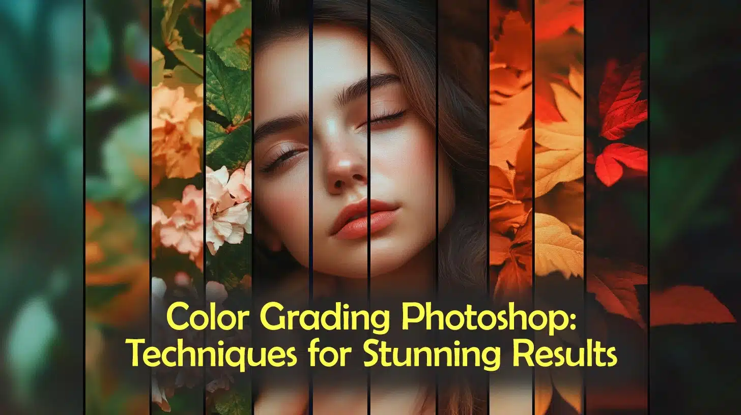
Color Grading Photoshop: Techniques for Stunning Results
Color Grading Photoshop: Techniques for Stunning Results
“Color grading Photoshop” is a powerful tool for enhancing the visual appeal of images, allowing photographers to transform simple photos into captivating masterpieces.
By adjusting tones and colors, you can achieve subtle enhancements or dramatic effects.
This article explores the essentials of color grading in Adobe, offering a step-by-step guide to help you elevate your skills.
It also compares Photoshop to Lightroom for color grading and introduces top plugins that provide creative freedom and precision.
Table of Contents
What is Color Grading?
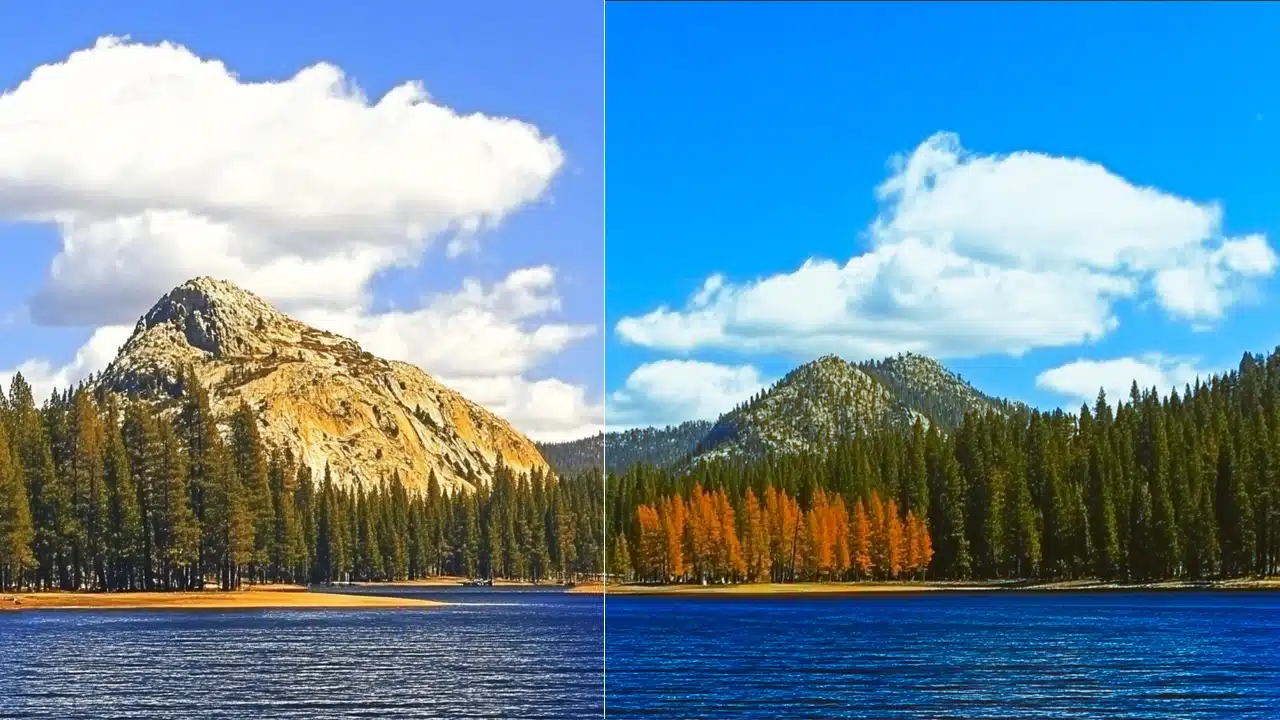
Color grading adjusts colors to convey a mood. Photographers use it to transform images and tell stories.
Through this process, images become more engaging and visually striking.
Key Aspects of Color Grading:
Color grading goes beyond basic corrections. While color correction ensures natural colors, color grading allows creative expression and style. The color wheel often helps to achieve this by balancing complementary colors.
In Photoshop and Lightroom, color grading enhances visual aesthetics. These tools provide a color grading panel that offers precise control over mid tones and hues. Users can develop their own unique looks with these options.
Photographers frequently employ a cinematic color grade techniques. This type of grading offers a dramatic and atmospheric look. It encourages viewers to feel emotions connected to the story told through the image.
Learning color grading in Photoshop creates stunning results. Both Adobe tools contain an impressive set of features for refining colors.
Embrace the possibilities and explore the creative potential within your own images.
The new Global Wheel feature in Lightroom simplifies color adjustments.
For those unfamiliar, the global wheel applies changes across an entire image while retaining natural hues. It’s less intimidating for beginners seeking improvements without complexity.
Steps to Utilize Color Grading Tools:
First, open your desired image in Lightroom Classic. Adjust the white balance to ensure neutrality. The next step involves fine-tuning the color tones using the dedicated panel.
Explore various settings like the blending slider and balance slider. Each modifies specific aspects of an image, allowing careful transitions between colors and intensity.
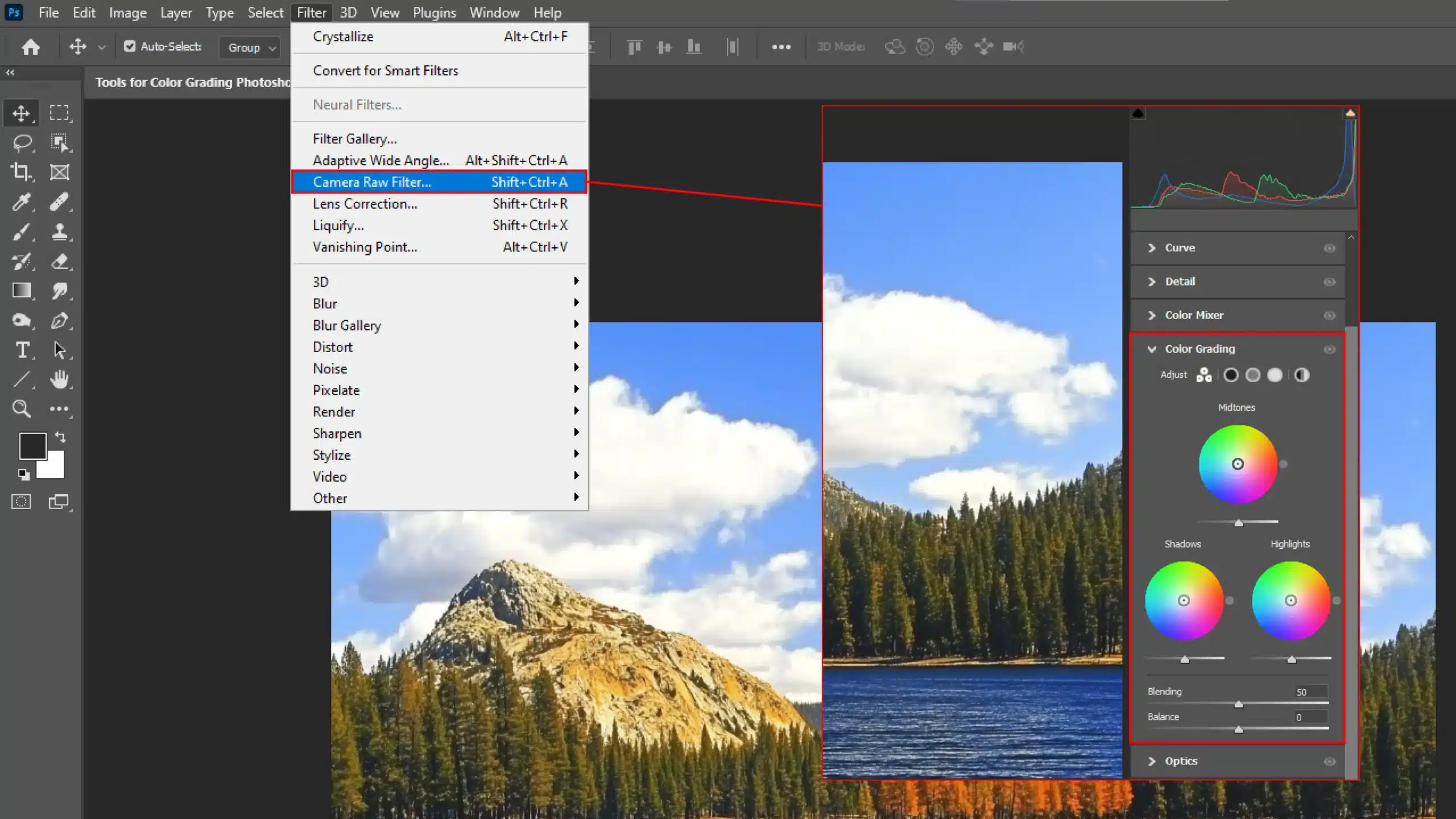
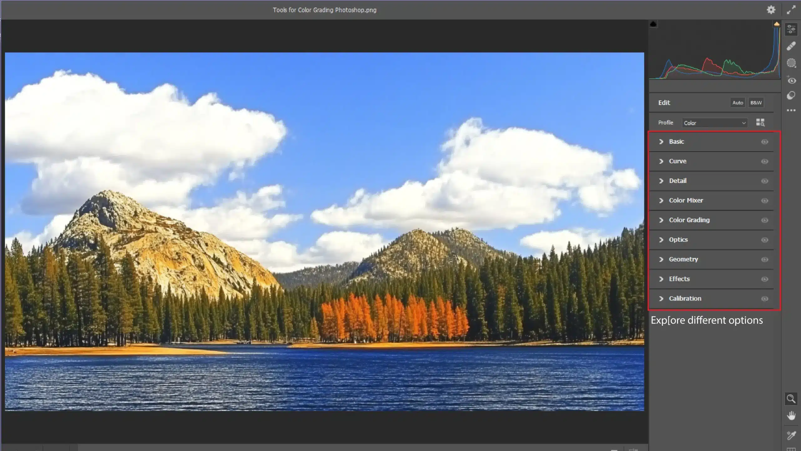
Those wishing to delve deeper should experiment with camera raw filter adjustments. The interface allows access to advanced tonal controls, including different color wheels we've discussed.
Benefits of Consistent Color Grading
Consistency in color grading sets the professional apart.
It brings harmony across projects. Ensuring that each photo or video maintains its intended feel, makes a photographer’s work recognizable.
Different colors linger when consistent techniques marry them cohesively.
Advantages of Consistency:
A consistent color grade builds familiarity with the viewer. It invites them to experience the familiar emotional tones. An artist's signature evolves with these practices, establishing a distinctive presence.
Effective use of techniques elevates the entire image presentation. Small, incremental changes deliver impactful results, ensuring viewers remain captivated by the subject and its narrative.
Even though adjustments might seem tedious, the end outcome proves rewarding. Consistency symbolizes dedication, care, and commitment to one's craft. Therefore, devoting effort is worthwhile, encouraging exploration and mastery.
Pro Tip: Don’t forget to use all the tools at your disposal, including color mixer and blend mode. They help creators achieve a more personalized touch.
The more you experiment, the more you learn to harness these features for remarkable compositions.
Tools for Color Grading Photoshop
Now, let’s look at a couple of useful tools for when you need to color grade in Photoshop
Using Adjustment Layers for Color Grading
Adjustment layers transform color decisions in Photoshop, offering a non-destructive editing process that preserves the original image.
This tool is a favorite among photographers for its adaptability and flexibility. With adjustment layers, color grading becomes an enjoyable and creative endeavor.
You can specifically target mid tones to enhance depth and dimension in your photos. The beauty of this method lies in the ability to toggle layers on or off, allowing for experimentation until your vision is realized.
The color wheel is a guide through a rich landscape of possibilities. It helps users discover how opposite colors harmonize, adding balance to their work.
By manipulating this tool, you can delve into cool and warm tones, finding effective ways to infuse emotion into photos.
Experimenting with complementary shades captures attention. Don’t shy away from deeper exploration; layering colors can develop a unique style.
Presets act as shortcuts for creating consistent effects with minimal effort. These ready-made adjustments are beloved by users for their efficiency and time-saving capabilities.
However, presets also encourage the accumulation of preferences over time.
Try cinematic color grading to evoke movie-like impressions in photos. A range of presets unlocks various looks suitable for storytelling.
Sounds enticing, right? Explore those pre-made options to witness instant transformations.
For those venturing into video editing, understanding how preset combinations influence sequences can significantly enhance output. Reserve experimentation for longer edits, trusting that initial changes will set a strong foundation.
Pro Tip: Adjust balance sliders, such as those for white balance adjustment, generously, but remember subtlety. Incremental changes can unleash potential while preserving intent.
Save each snapshot as reassurance throughout the refining stages.
Step-by-Step Guide to Color Grading
As digital creatives, enhancing images requires color grading. Let’s dive into practical ways to transform photos into visual stories.
Basic Techniques for Beginners
Starting might feel daunting, but soon, it’ll be second nature.
Begin with straightforward tools like basic color correction:
Adjust brightness and contrast first. Remember, sometimes less is indeed more.
Play with mid tones to enhance the depth of an image.
Explore the new color grading panel and see how it impacts your canvas.
Adjusting these elements brings life to otherwise ordinary photos. For those using Lightroom, mastering Lightroom shortcuts can significantly speed up your workflow.
Pro Tip: Learn Photoshop shortcuts as well for an even deeper understanding.
Advanced Methods for Professionals
Professionals perfect using tools like color wheels for nuanced shifts. They tweak with precision to create high-quality output.
This is where color grading in Photoshop reaches artistry:
Use the camera raw filter for detailed adjustments.
Focus on subtlety: sometimes smoothing out a single tiny shade can change the mood entirely.
Layer different edits for dynamic post-production work.
It can sometimes feel intense juggling all the details, right?
Alright, picture this: you’ve snapped an amazing photo, but the colors aren’t quite right.
This is where color correction and color grading come in. Both are important, but they serve different purposes.
Understanding the Differences
Let’s dive into the differences.
Color Correction
Color correcting is like putting on your reading glasses.
It focuses on adjusting colors to make them look natural and balanced; like the sky being the right shade of blue. You tweak brightness, contrast, and color tones until it looks “just right.”
It’s the first step in making your photo a masterpiece. The essential tools in Lightroom are used for color correction, allowing you to adjust white balance and exposure with precision.
That’s your chance to get creative! It’s like adding spices to your dish. It sets the mood, tells a story, and gives your visual narrative that extra “oomph”.
Mid tones come alive, cinematic vibes emerge, and the photo gains an emotional depth. This is where color grading in Photoshop can truly shine, especially when using blending modes to achieve unique effects.
When to Use Each Technique
Now, let’s look at when each technique is most useful.
Technique
Use
Color Correction
To correct colors in a image or video to get them back to how they should look like.
Color Grading
To give your images and videos a stylistic look.
Color Correction
Choosing between them depends on your goal. For accurate representation, start with color correction.
Use it when you’re dealing with photos that must look real, like product images or portraits.
Color Grading
However, when you’re aiming for something more dramatic? Color grade away!
Use color grading when crafting artful shots or enhancing post-production videos. It’s where color wheels become your best friends, spinning up different moods with every hue you adjust.
Pro Tip: When in doubt, start simple. Apply basic color correction first, then unleash your creativity with color grading!
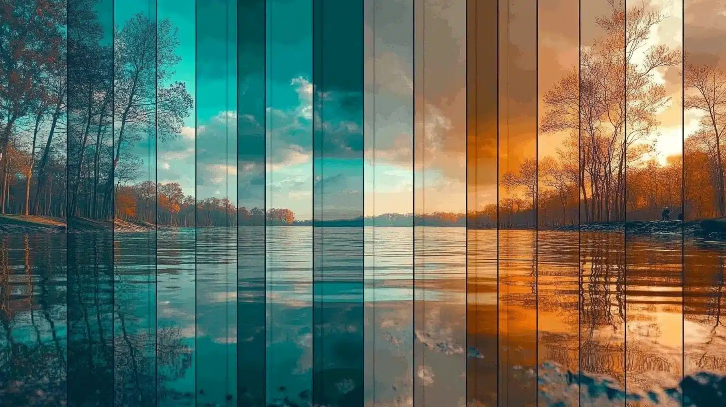
Exploring Different Styles of Color Grading
Working with colors in Photoshop and Lightroom can be a fun ride. Trust me, it’s not as dull as it might sound.
I’ve spent countless hours making sure each color grade pops just right.
So, grab your digital brush and let’s look at some creative color grading styles that can transform your images into magic.
Cinematic Color Grading
Cinematic color grading is what gives movies that breathtaking feel.
Think about your favorite film. The way its colors make you feel? That’s the magic of cinematic grading.
Using Photoshop, we play with shadow and contrast to give life to images. It’s about evoking emotion, turning stills into storytelling pieces.
Start by understanding those feelings and translate them through color wheels. You don’t just change shadows, you shift moods.
It creates atmosphere, drawing viewers in. Just don’t overdo it!
Vintage and Retro Styles
Imagine a walk down memory lane with a classic twist.
Vintage and retro styles take us back in time using warm hues and faded tones. This color grade breathes nostalgia.
When working with such styles, experimentation is key. Pull inspiration from old photos and get playful with color tone.
Dusty hues, sepia tint, or subdued softness, each has a way of speaking stories of the past. Go ahead, dive into the archives and create magic by channeling your inner historian!
Pro Tip: Check out how to add the old photo tone while editing to add some extra flare.
Modern and Vibrant Looks
On the opposite spectrum, we have the dynamic modern and vibrant looks. Here, it’s all about energy; life explodes on canvas through vivid colors.
In this case, Photoshop becomes your best friend, while Lightroom polishes the edges. Embrace the new features in Photoshop and technology that come with these tools and enhance those blues and reds!
Saturate wisely. A modern finish requires balance.
Too much saturation and you risk making things look a little too unnatural.
But when done right? Your photos practically leap off the screen.
Pro Tip: Check out these Lightroom editing tips for a better understanding of the process.
Post-Production Adventure
The adventure continues long after capturing the shot, into post-production. That’s where the excitement of color exists.
Ideal for storytellers, color grading takes simple snaps and turns them into storytelling marvels.
Pro Tip: Start simple with your color grade adjustments, then build complexity.
Better yet, save your settings. That way, consistency remains a click away.
And don’t forget to explore different digital cameras to find the one that best suits your style and needs.
Frequently Asked Questions (FAQs)
How do you do color grading in Photoshop?
Open your image in Photoshop.
Go to the Adjustments panel and select Color Balance or Selective Color to tweak the colors.
Use Curves and Levels for more control over the lighting and color dynamics.
Experiment with Hue/Saturation adjustments to fine-tune the colors further.
Apply a photo filter or gradient map for stylized effects.
Is Colour grading in Photoshop better than Lightroom?
Photoshop offers more precise control with layers and masks, ideal for complex edits.
Lightroom provides a more user-friendly interface and faster workflow for basic color adjustments.
Choice depends on the complexity of the project and your personal preference.
What is the best way to color grade photos?
Start with a vision or mood for the image to guide your color choices.
Adjust basic settings like exposure, contrast, and white balance first.
Use color grading tools to enhance or change the mood of the photo.
Always keep an eye on skin tones and natural colors to maintain realism.
Consider using presets or LUTs as a starting point, then customize further.
What is the best color grading plugin for Photoshop?
Color Efex Pro: Part of the Nik Collection, offers various filters and presets for creative effects.
Magic Bullet Looks: Provides professional color grading options with an extensive library of presets.
Exposure X: Combines photo adjustments with analog film emulation for unique color grades.
Gradient Maps: Native to Photoshop, allows for highly customizable color grading using gradient overlays.
Mastering color grading in Photoshop has been a transformative experience. It’s not just about adjusting colors; it’s about bringing a vision to life and adding depth to images.
Learning “color grading Photoshop” has enhanced my ability to create captivating visuals, with even subtle changes having a profound impact.
If you’re looking to elevate your skills, I highly recommend a dedicated Photoshop course. For those interested in other options, there’s also a fantastic Lightroom course. Both offer valuable insights and techniques for any aspiring photographer or digital artist.
Embracing color grading has fueled my passion for creative expression.
If this article has helped you, then Like and Share it with your friends
$2,061.00Original price was: $2,061.00.$1,061.00Current price is: $1,061.00. 27583
Download Your Free Guide Now!
Discover the secrets of photography with our printable guide! Master essential techniques like aperture, shutter speed, and ISO to create stunning images. Get your free printable PDF now and start turning your snapshots into masterpieces!