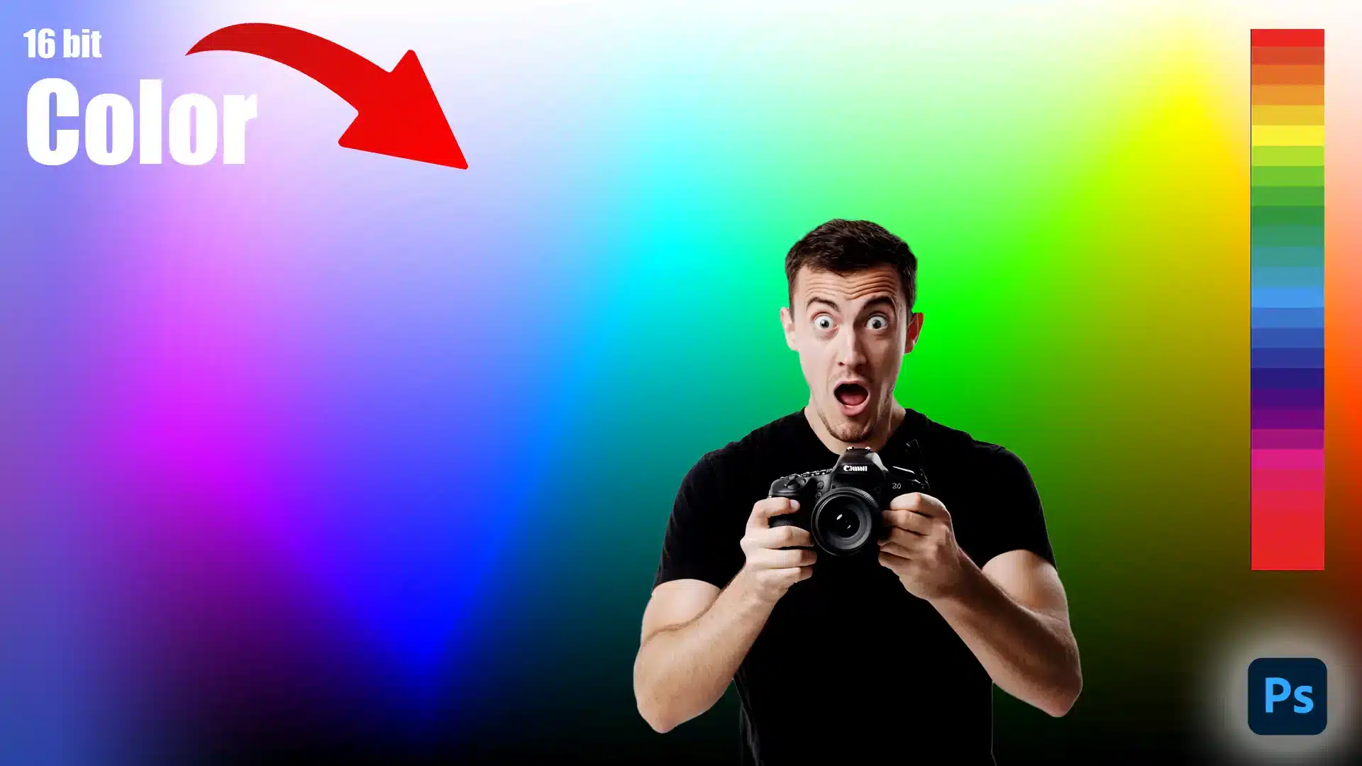
When it comes to achieving stunning, true-to-life images, understanding the power of 16 bit color is crucial.
Imagine the vibrant hues of a sunset or the intricate details in a shadow. 16 bit color allows you to capture and enhance these elements with incredible precision.
As a photographer or designer, leveraging this depth can transform your work from ordinary to extraordinary.
Curious about how this works and why it matters?
Let’s dive into the captivating world of 16 bit color and uncover how it can elevate your creative projects to new heights.
Table of Contents
Understanding 16 Bit Color
16 bit color refers to digital images allocated with 16 bits of data per channel. We have 65,536 possible shades per channel, unlike 256 shades in 8-bit color.
Each color channel red, green, and blue is richer. This bit depth creates smoother gradients and finer details.
In 16 bit color mode, the hue variability is more extensive than in common editing modes.
Editing images in 16 bit ensures minimal data loss during adjustments.
Moreover, 16 bit color provides richer tonal values. It’s ideal for professional work requiring precision.
History of 16 Bit Color
Initially, computers worked with 8 bit color due to hardware constraints.
As processing power increased, manufacturers adopted higher bit depths. Early 16 bit color systems marked a breakthrough by enhancing image quality.
The shift from 8 bit to 16 bit was pivotal in the evolution of computer graphics.
Adobe Photoshop and similar tools later integrated 16 bit support, revolutionizing creative workflows.
This evolution allowed smoother transitions and better editing latitude. Nowadays, many photographers prefer 16 bit for its superior quality.
Early adopters witnessed huge improvements in image quality.
As hardware improved, software like Photoshop and Lightroom integrated 16-bit support, revolutionizing creative workflows.
Early adopters experienced substantial improvements in image quality, making it easier to apply Special Effects and Filters with greater accuracy.
Why Use 16 Bit Color?
16 bit color improves overall image fidelity by offering a broader spectrum. It’s crucial for capturing subtle shifts in brightness.
The greater tonal range helps in detailed shadow and highlight adjustments. In short, you get richer and true-to-life colors.
If you are looking to refine your skills understanding the Difference Between Photoshop and Lightroom can help you leverage 16 bit color effectively in your editing process.
Additionally, it’s beneficial for High Dynamic Range (HDR) Photography, where maintaining gradient smoothness is key.
Using 16 bit color maintains integrity through editing processes. Raw files captured in 16 bit preserve more data.
This allows greater flexibility during processing, such as altering saturation or exposure. Post-processing changes are smoother and more accurate.
For anyone working with HDR (high dynamic range), 16 bit is essential. It keeps gradient smoothness intact despite heavy edits. Also, stacking raw images for light-painting or composite shots becomes easier.
Detail in both shadows and highlights stays. Your edits remain seamless. More efforts yield refined results.
Pro Tip: Always start with 16 bit or raw files when editing. Preserve every detail and ensure the highest quality results.
it’s essential to understand how gradient techniques enhance image quality. With 16-bit color, gradients are smoother, providing richer tonal transitions.
For those using Adobe Photoshop, understanding how to utilize essential tools in Photoshop can further enhance your editing capabilities.
Additionally, knowing the difference between RAW or JPEG format can help you make informed decisions about your workflow.
How to Work with 16 Bit Color
Before diving into editing, setting up your workspace is important. A clean, organized space helps maintain focus and efficiency.
When dealing with 16-bit color, ensure your computer and software support 16-bit processing.
Update your software regularly, this keeps all tools and functions running smoothly.
Choosing the Right Software
Not all software is created equal. Pick software that supports 16-bit color. Photoshop and Lightroom are prime choices.
These tools offer flexibility and precision.
Check for tutorials inside the software to understand its features better. For instance, learning essential tools in Lightroom can significantly enhance your workflow.
Editing in 16 Bit Color
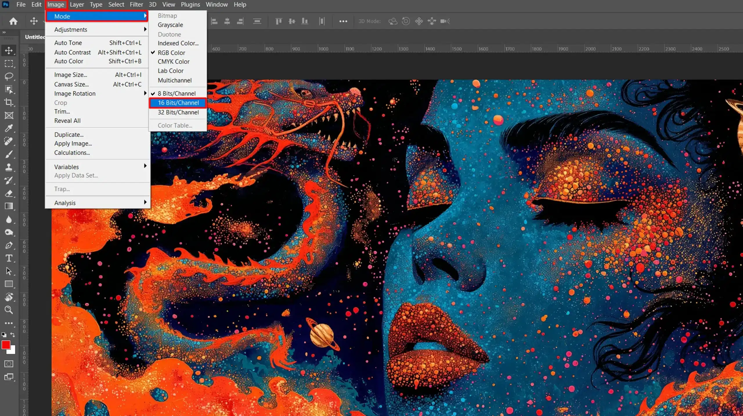
Editing photos with 16-bit color enhances detail. Make sure to open your raw file in a 16-bit mode. This preserves pixel maximum value.
- Work carefully with color channels, especially the blue channel, which often needs attention. Adjust each color channel, red, green, and blue to balance the colors accurately.
- Understand that the human eye perceives green light intensely, so tweak the green channel accordingly.
Remember, bit depth influences how much color information an image holds. In 16-bit color, images have richer tonal values compared to 8-bit images.
Higher bit depth also minimizes data loss during the editing process. Be cautious, though; 16-bit files are larger and need more storage.
Employ layers and masks to fine-tune adjustments. This approach preserves the original data. Also, use non-destructive editing methods.
Pro Tip: Always save your edited files in a 16-bit format to retain high quality images, even if your final output will be 8-bit. This preserves the integrity over multiple editing sessions.
Additionally, understanding the difference between Photoshop and Lightroom can help you decide which software to use for specific tasks.
Adjusting pixel values affects how images display on graphics cards, influencing the contrast between pure white and pure black.
This adjustment can also impact file size, as higher pixel merit often lead to larger file sizes.
Balancing these elements ensures optimal image clarity and efficient file management.
16 Bit Color vs Other Color Depths
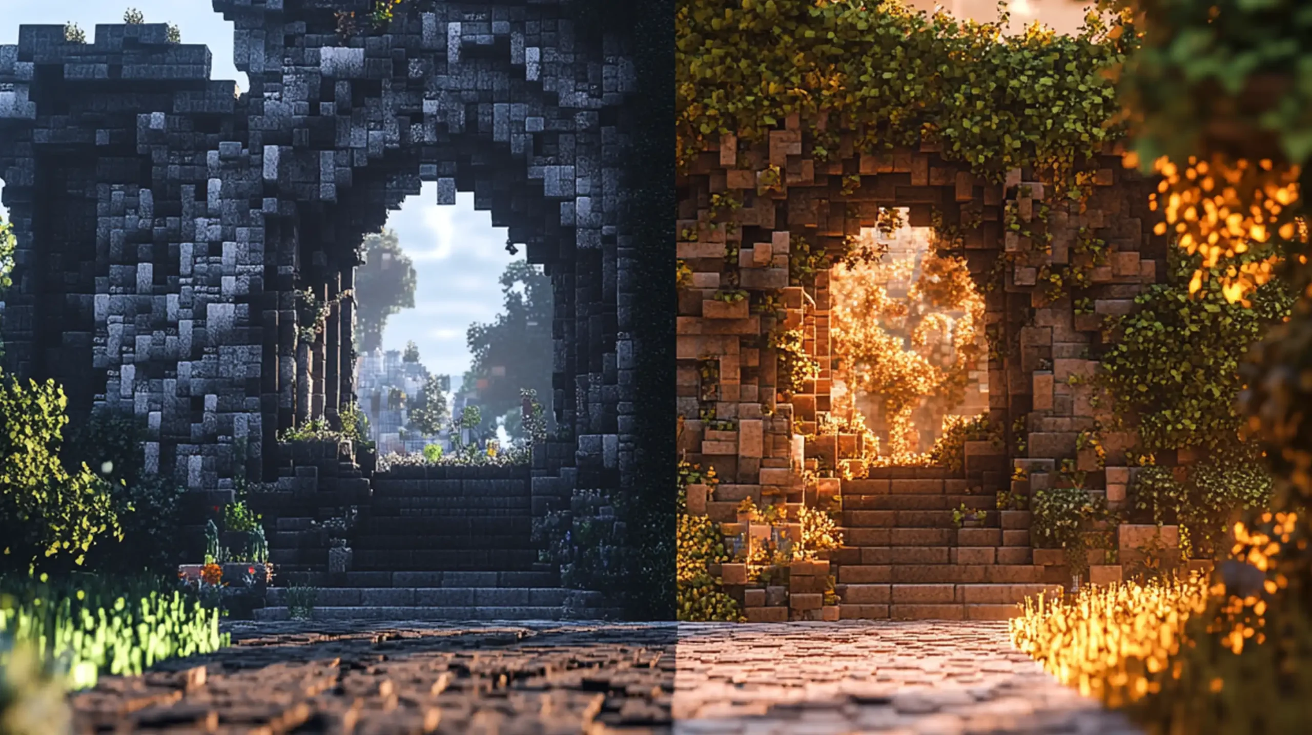
Understanding different color depths is crucial for producing high-quality images.
Color depth, measured in bits, determines how many shades of each color a digital image can display.
8 Bit vs 16 Bit Color
Let’s start with the basics. 8 bit color means each of the red, blue, and green channels has 256 values.
This sounds great until you need more detailed images. Switching to 16 bit color gives us 65,536 values per channel. The 16 bit images hold more details and show smoother gradients.
In 8 bit, editing heavily often results in banding where colors break into visible bands. With 16 bit, this is less of an issue. More data means more room to play without compromising quality.
If Photoshop or Lightroom supports it, working in 16 bit can enhance your editing experience.
Higher bit depth offers more flexibility.
Remember to save your work in 16 bit format.
Technically, it’s less noisy and holds up better under heavy edits.
16 Bit vs 32 Bit Color
Moving up to 32 bit seems like a quantum leap. It’s overkill for most uses.
The primary aim of 32 bit is precision in special effects and HDR processing. However, file sizes are much larger.
Handling them requires more computational power.
Our old computers might struggle with 32-bit files.
Stick to 16 bit unless you’re working on professional-grade projects involving advanced compositing.
While the extra headroom in 32 bits provides more control, 16 bit strikes a good balance between quality and manageability.
Benefits of Higher Color Depths
Higher color depths produce smoother transitions and richer colors. Our digital images retain more information. This aids in post-processing, where every tweak can make a difference.
- Higher bit depth enhances image clarity, reducing visually disturbing artifacts.
- It provides a broader color envelope, capturing the finer nuances in light and shadow.
- Working with 16 bit images allows for greater flexibility when adjusting specific areas, like the blue
For instance, one could adjust the blue or red channel without disrupting the overall tonal balance. Increased bit depth also means fewer chances of color banding, resulting in smoother gradients.
Pro Tip: If you’re aiming for perfection, always shoot in NEF or JPEG format and edit in 16 bit.
This ensures your photos capture and retain maximum detail, giving you the best possible canvas to work on in Photoshop or Lightroom.
Technical Aspects of 16 Bit Color
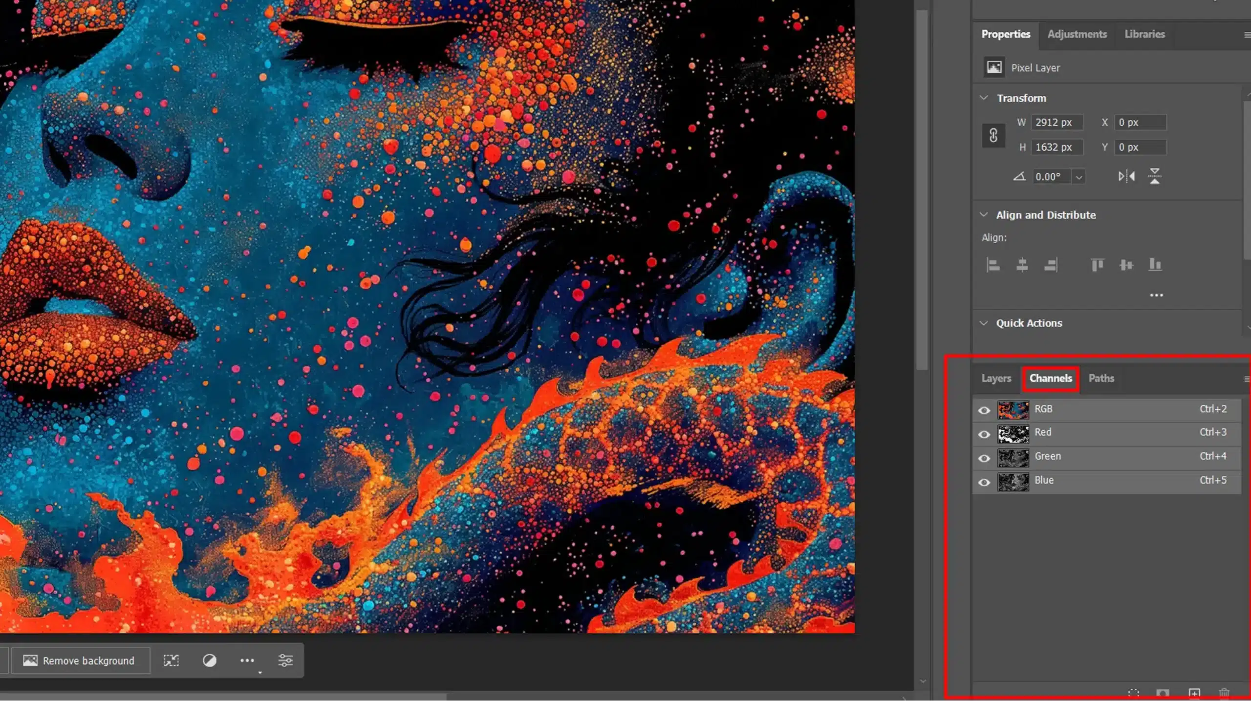
Alright, let’s break it down. Every digital image comprises three main channels: red, green, and blue.
These channels combine to create the full spectrum of colors we see on the screen.
Each channel holds a certain range of values; for example, an 8-bit image has values between 0 and 255 per channel. In a 16-bit image, this range jumps to 0 and 65,535, allowing for a greater depth and more detailed editing.
Understanding the technical aspects of 16 bit color helps in mastering advanced edits like selective color adjustments. This depth provides more precision for nuanced color corrections.
Red and Blue Channels
When working with both the red channel and blue together, the aim is to strike a balance. Too much of either can offset the color harmony.
By carefully adjusting these, you maintain the vibrancy and integrity of your same image.
Blue Channel
The blue channel is critically important.
Often, the blue component of an image needs special handling because it’s more sensitive to noise. Proper adjustment here can mitigate some common issues seen in photos, like unnecessary fuzziness or color distortion.
By focusing on the blue channel, we can preserve the details and enhance the overall quality.
Red or Blue Channel
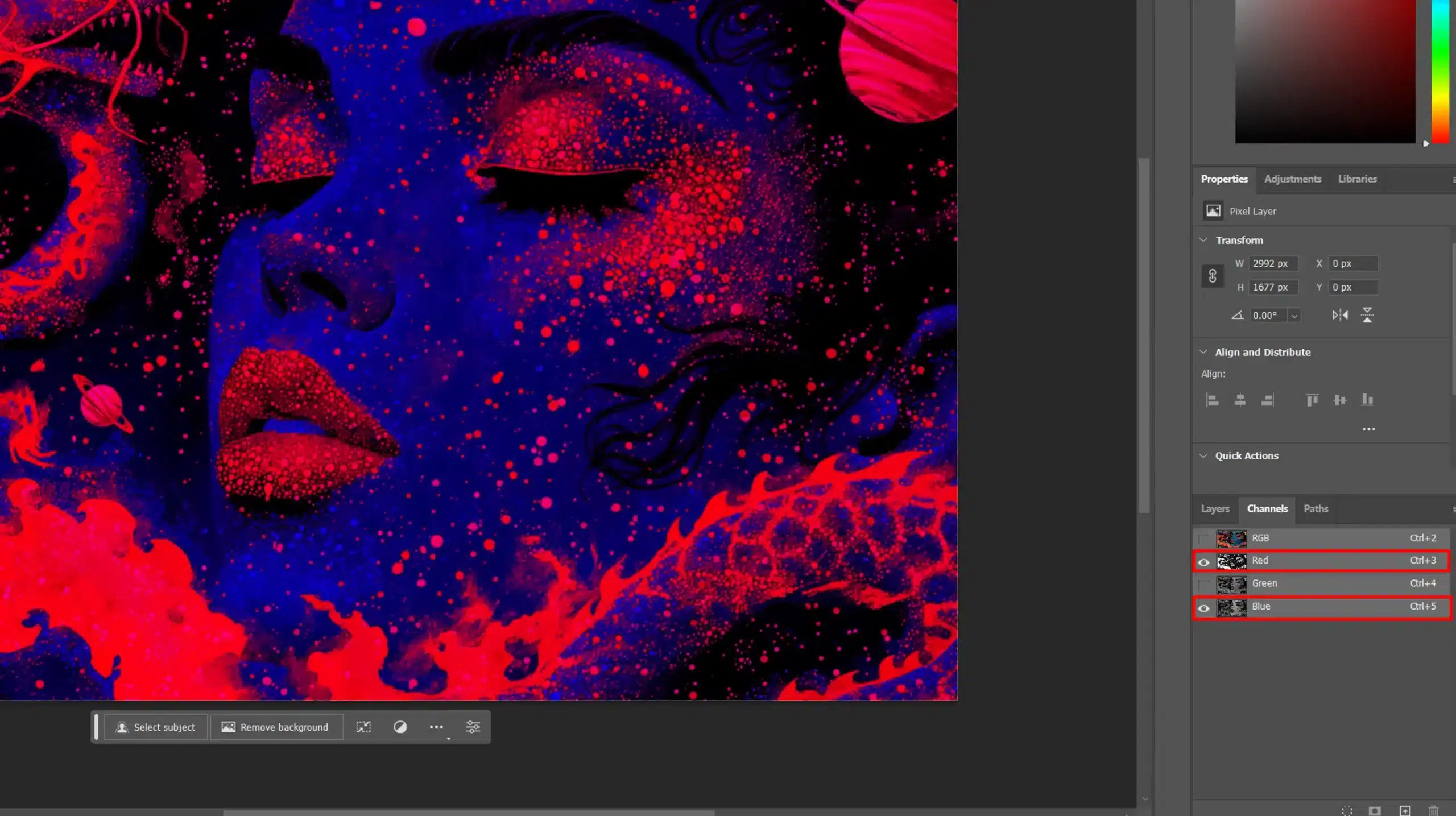
When working with image adjustments in Photoshop, you can use the Red and Blue Channel to enhance specific color details and optimize video signal quality.
Each color channel Red, Green, and Blue represents a different component of the image’s color information.
By isolating the Red and Blue, you can fine-tune the color balance, contrast, and brightness specific to those colors.
This is particularly useful for improving signal clarity, as adjusting these channels can enhance reds, blues, and other colors in your image.
This technique allows for precise color corrections and creative effects, giving you greater control over your image’s overall look and quality.
Green Channel
Green is where our eyes are most sensitive. This makes the green channel essential for achieving natural-looking landscapes and portraits. When adjusted accurately, it balances the other channels and creates a more realistic image.
Important Reminder
Remember, always save your raw file before major edits. This keeps the original data intact for future tweaks.
Pro Tip: Shoot in 16-bit RAW format whenever possible. This preserves maximum detail and offers more flexibility during editing.
Also, staying organized in Photoshop or Lightroom helps maintain efficiency and focus. Utilize essential tools in Lightroom to streamline your workflow and achieve the best results.
Common Uses of 16 Bit Color
As we delve into the world of 16-bit color, we see its unique benefits and practical applications.
| Use Case | Description | Advantages | Disadvantages |
|---|---|---|---|
| Digital Photography | Captures high-quality images with smooth color gradients. | Improved color depth and accuracy. | Larger file sizes. |
| Video Editing | Used for high-definition video content with better color representation. | Enhanced visual fidelity. | Requires more storage and processing power. |
| Medical Imaging | Provides detailed color information for diagnostic imaging. | Precise color differentiation. | More complex data management. |
| Graphic Design | Allows for detailed and vibrant color in digital art and design. | Richer colors and smoother transitions. | Higher demand on hardware resources. |
| Gaming | Enhances visual quality in games with richer color details. | More immersive and realistic visuals. | Can increase game file size. |
Photography
Photographers gravitate to 16-bit color for a significant reason: detail. Imagine capturing a sunset. The gradient from light to dark holds more nuances. These get lost in 8-bit images. Here, the detail stretches with the enhanced color depth.
When editing photos in Lightroom, you preserve richer, more vibrant images. Enhancing every shadow and highlight without losing data becomes easier.
That famous photo of the red tree against a blue sky? You’d notice every leaf in detail.
However, those large file sizes can be a bit daunting.
Patience is your friend while your software processes these lush files. Don’t rush, quality takes time. The results speak for themselves.
Graphic Design
Graphic designers benefit noticeably from 16-bit color. When crafting logos or illustrations, the extended color palette makes all the difference.
Subtle shades and transitions appear seamless. This makes your work stand out compared to designs created in 8-bit color.
Designing with 16-bit color helps in achieving a professional finish. You avoid the unsightly banding often seen in 8-bit designs.
A gradient in an 8-bit might show visible lines. In a 16-bit, it flows smoothly. Revamping brand colors becomes easier when all transitions and shades stay intact.
In graphic design, mastering techniques like refine edges is crucial for precision. With 16-bit color, you can achieve cleaner and more detailed edges.
Video Editing
Video editing also thrives on 16-bit color. Working with raw footage often involves color grading. Here, the additional precision matters.
You can tweak every clip without distortion. Adding special effects? The extra color data means more realistic results.
Consider the alpha channel in your video. Handling transparency is efficient and cleaner. Your final output, whether for an indie film or a YouTube tutorial, will look polished and professional.
While 8-bit editing can feel limiting, 16-bit offers a broader range. Smooth transitions ensure that scenes transition smoothly, maintaining a fluid and professional flow throughout your video.
It’s ideal for extensive edits where image integrity matters.
Pro Tip: Always invest in good display devices. High-quality screens, like lcd screens, accurately represent your colors. This ensures what you edit is what your audience sees.
One of the common uses of 16 bit color is achieving flawless edits, such as smooth skin. With 16-bit depth, you get more precise control for perfecting skin textures.
Frequently Asked Questions (FAQs)

What is a 16-bit color?
- 16-bit color is a type of digital color format that uses 16 bits per pixel. This allows for 65,536 different colors to be displayed. It's more advanced than 8-bit color, which only supports 256 colors.
Is 16-bit or 32-bit color better?
- 32-bit color is generally better than 16-bit color because it provides more color depth. With 32-bit color, you can display over 4 billion colors, making images appear smoother and more detailed.
What is a 16-bit color combination?
- A 16-bit color combination refers to the mix of red, green, and blue (RGB) values that each take a portion of the 16 bits. Typically, 5 bits are for red, 6 bits for green, and 5 bits for blue. This combination allows for different shades and hues to be created.
Is 8-bit or 16-bit color better?
- 16-bit color is better than 8-bit color. While 8-bit offers basic color options suitable for simple graphics, 16-bit color provides a wider range of colors, making it better for more detailed images and smoother gradients.
In conclusion, working with 16-bit color in your images can truly transform your editing process. From my experience, using 16-bit color allows for smoother color gradients and more detailed adjustments, which can make a huge difference in the final result.
If you’re interested in learning these techniques in more depth, I highly recommend my Photoshop course and Lightroom Course.
These courses offer step-by-step guides and practical tips to help you get the most out of your editing software.
By mastering 16-bit color and other features, you’ll be able to enhance your photos like never before. Keep experimenting and have fun with your editing; your creativity is the limit.
Read more about Photoshop & Lightroom:

