How to Change Color Mode in Photoshop: A Step-by-Step Guide
How to Change Color Mode in Photoshop: A Step-by-Step Guide
Are you struggling with how to change color mode in Photoshop? You’re not alone! Many people find it challenging to navigate through the various color settings, but don’t worry I’m here to help.
In this guide, I’ll take you through the simple steps to adjust color modes, ensuring your images look just the way you envision them.
Whether you’re a beginner or need a quick refresher, this article will capture your attention and provide the information you need.
Discover how easy it can be to master color adjustments and enhance your creative projects. Let’s dive in and transform your Photoshop skills today!
Table of Contents
Understanding Color Modes
Color modes play a significant role in how your images are displayed and perceived. Selecting the right color mode, such as duotone mode, can enhance your work’s visual impact and ensure it aligns with your intended output.
Let’s explore why making the right choice is important.
Importance of Choosing the Right Color Mode
Color modes determine how colors display and print. For those tinkering with computer monitors, knowing your color mode in Photoshop guides you on image representation.
If you’re curious about how to change color mode in Photoshop, you’ll find it important to understand the uses of RGB and CMYK.
RGB and CMYK Modes
RGB color mode relies on red, green, and blue light, significant for screens. While creating digital art or web content, RGB mode gives the best vibrancy using its color space.
Conversely, when printing, switching to CMYK mode ensures better color management and alignment with printer capabilities.
Other Color Modes
Here are additional color modes in Photoshop, each with unique benefits for your project needs:
Indexed Color Mode: Reflects a more limited spectrum, reducing file size but potentially compromising image quality.
Bitmap Mode: Might serve monochrome needs.
Grayscale Mode: Uses brightness values rather than color values.
Each mode affects file size differently; RGB images consume more space due to more involved color data.
Color Management and Settings
The color settings dialog box plays a pivotal role in color management. Adjusting the default color space can lead to more precise color reproduction.
Without adaptation, converting images from one mode to another may cause discrepancies.
The device-independent color model in Lab color mode aids consistency across platforms.
Adobe Photoshop provides tools, yet understanding core concepts enhances the user’s control over the finished work.
Color Space
Color space, such as sRGB, Adobe RGB, and others, influences how wide the visible spectrum appears.
For instance, Adobe RGB provides a broader color gamut than sRGB, often significant for professional photo editing.
Making informed decisions about default settings in your software is imperative. Understanding different shades within these spaces supports accurate and appealing outputs.
Pro Tip: Always preview your final image in both RGB and CMYK modes if it will be printed.
This way, unforeseen shifts in colors can be anticipated, and necessary adjustments can be made to preserve the original design intent.
Additionally, using tools like the patch tool in Photoshop can help refine any color inconsistencies that may arise during the editing process.
How to Change Color Mode in Photoshop
The color mode in Photoshop is more than just a feature. It’s a lifesaver for accurate color projects. Imagine having a stunning photo on your computer screens that looks great in RGB color mode.
But when you print it, the colors seem off. That’s where knowing how to change the color mode becomes handy.
Step-by-Step Guide for Changing Color Mode in Photoshop
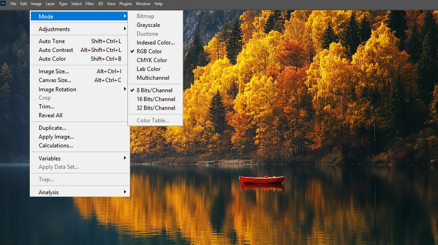
Changing a color mode feels like opening a treasure chest. Let’s begin by accessing the color settings dialog box, where we’ll make our first adjustment. This straightforward process will help you achieve the results you need.
Open your image: First, launch Photoshop and open the image file you want to modify.
Navigate to Image > Mode: The next step involves choosing 'Image' from the menu, then hovering over 'Mode'. A dropdown list of options welcomes you.
Practical Examples
Let’s demystify color space with practical examples. Do you ever wonder how designers make that perfect black-and-white photo from a full-color original?
They choose the grayscale mode. In a snap, the image transforms, using ‘brightness value‘ to depict shades.
Grayscale vs. Bitmap: Want only two colors? Choose bitmap mode. No shades, just absolute contrast.
Printing MVPs: For printing, the champion is CMYK mode. Say ‘CMYK’ converts your primary colors for perfect prints each time.
The RGB mode shines on computer monitors, displaying hues vividly. A cinch for digital creators! What clinches the magic is the device-independent color model, ensuring your colors remain true across all devices.
Color Spaces and Models
Let’s untwist the difference between a color space and color models. You often confuse them, but critical aspects differentiate each.
RGB color space is where all our digital magic happens with its primary colors: red, green, and blue. Complementing it, photographers favor CMYK color space when printing dreams on paper.
Equally important, the color lookup table provides you with the map of tones an indexed color mode needs.
By reducing the image’s palette numbers, you trim file sizes! Thus, understanding how to match grayscale values with silhouettes eases the shift from color to grayscale image marvels.
Exploring Different Color Modes
Photography and image editing can be both art and science. Color modes guide us in navigating through the colorful world of digital images.
To better understand the various color modes in Photoshop, here’s a comparison table that outlines the primary modes we frequently encounter. Let’s dive into the primary color modes we encounter.
Aspect
Overview
RGB Color Mode
Uses Red, Green, and Blue to create vibrant displays on digital screens.
CMYK Color Mode
Utilizes Cyan, Magenta, Yellow, and Key (Black) for accurate color representation in printing.
Grayscale Mode
Focuses on shades of gray, ideal for depth and contrast without color distractions.
Indexed Color Mode
Limits colors to optimize images, saving space while maintaining reasonable quality.
Duotone Mode
Combines two colors to add depth and emotional impact to prints.
RGB Color Mode
RGB stands for Red, Green, and Blue. These three colors create all sorts of magic on digital screens. Computers, TVs, and phones depend on this mode for vibrant displays.
When we discuss the RGB color space, we’re considering various shades that are possible by combining these primary colors.
Switching to the RGB mode is handy for anything meant for the web or displayed digitally. Adjusting color levels here impacts how the image appears on screens.
For those using tools like Photoshop, understanding RGB is important for tasks such as using the replace color tool in Photoshop to fine-tune hues.
CMYK Color Mode
The CMYK color mode brings another combo of colors: Cyan, Magenta, Yellow, and Key (Black). Printing relies on this mode. It’s like mixing paint, only digital. Going from RGB to CMYK might make colors look less bright.
I once designed a poster that looked vibrant on screen, but it printed with dull colors due to the CMYK color space.
Understanding how the color space interacts is important to achieving the desired print results. If you’re working in Lightroom, knowing how to adjust color preferences can help when transitioning between these modes.
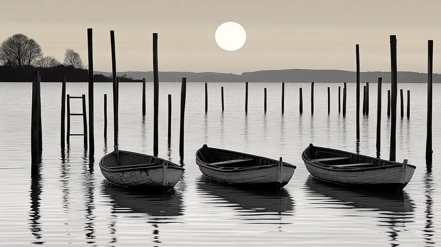
Grayscale Mode
Ever seen a black-and-white movie? That’s grayscale. Enter the grayscale mode when you need depth using shades of gray. Think of it as a palette cleanser, concentrating on contrast without distractions.
Grayscale strips away all colors, focusing purely on lightness. Ideal for moody portraits or dramatic scenes.
It also plays a role in reducing file sizes, perfect for quick web loading times.
Other Photoshop Color Mode Settings
We can also explore other color modes, such as indexed color. Indexed colors optimize images for minimal colors, saving space without losing much quality.
Useful if you’re tight on storage. Designers also explore the duotone mode. This merges two inks – adding depth or emotion to prints.
Color management comes into play here. Choose the right color model. Selecting the appropriate color model is crucial for your final output, as each mode has its unique characteristics and intended use. Using them wisely improves the quality of your projects.
Pro Tip: Always preview your work in the right color mode based on its final use – whether print or digital. It ensures the final piece matches your artistic vision.
This practice ensures the final piece matches your artistic vision and helps maintain Lightroom export quality.
Using the Color Settings Dialog Box for Adjusting Color Mode in Photoshop
Photoshop and Lightroom allow us to manipulate images in various color spaces, each serving a specific purpose.
Let’s explore how to make the most of the color preferences, particularly when considering the difference between Photoshop and Lightroom in handling these adjustments.
Navigating the Dialog Box
The color settings dialog box is our gateway to precise adjustments. First, access it from the edit menu. In this box, you’ll see options for default color space, such as RGB, CMYK, and grayscale.
Don’t be overwhelmed; it’s the starting point for effective color management.
Understanding these settings is important, especially if you’re working with different digital cameras that may capture colors differently.
Inside this dialog, we can choose settings that impact our images’ colors significantly.
By selecting the right RGB color mode, for instance, we tailor images for digital screens using a combination of the primary colors.
Customizing Color Settings
Customizing these settings allows you to meet specific project needs more effectively. If printing is your concern, switch to CMYK mode. This color model, while different from RGB, ensures printed colors are as close to the digital view as possible.
Moreover, for web graphics or images with limited palettes, indexed color might be your choice. It simplifies the color space without compromising visual quality significantly.
As you tweak settings, think about how they relate to the final presentation of your work. Remember, comprehensive color management ensures consistency across various devices and outputs.
Pro Tip: When adjusting your color settings, remember to utilize the Photoshop black and white shortcut for quick conversions if you need a monochrome effect.
Additionally, exploring blending modes in Photoshop can enhance your color adjustments by allowing you to layer effects creatively.
Advanced Tips for Changing Color Mode in Photoshop
Starting with Photoshop can be challenging, particularly when navigating color modes. Have you ever wondered how to change color mode in Photoshop or which color space to choose? Let’s clarify this together.
Optimizing Workflow
Familiarizing yourself with color palettes can enhance your workflow. Let’s explore how these palettes can improve your design process.
Understanding Color Palettes
Imagine you’re painting with a basic palette of the primary colors. It works wonders for digital art. To further enhance your workflow, familiarize yourself withessential tools in Photoshop that can make managing colors more efficient.
Switching to CMYK
Now, switching to CMYK can feel daunting. It’s like adding spices to a dish where just salt used to work. If you’re preparing for print, using CMYK is the way to go.
This color mode helps ensure that what you see on the screen matches the final printed product, preventing unexpected results at the print shop!
Additionally, using Photoshop shortcuts can significantly speed up your process, allowing you to focus more on creative tasks.
Troubleshooting Color Issues: Changing Color Mode in Photoshop
Issues with colors often crop up unexpectedly. It’s usually the wrong color space. An image might look vibrant on your screen but dull when printed.
My advice? Double-check your color space before hitting ‘print’.
Adjusting Proof Setup
If you continue to encounter issues, consider adjusting the proof setup found in your view menu. This tool allows you to preview how your colors will appear in different settings. Make the necessary adjustments until the colors align with your vision.
Consistency Across Devices
Struggling with color profiles? Remember, not all software interprets colors the same way. Make sure your setup is aligned with your final output device.
Pro Tip: When working withcolor profiles in Photoshop, use thePhotoshop text box to check and adjust your settings. This can help ensure that your colors remain consistent across various devices and outputs.
Frequently Asked Questions
What steps should I follow to change RGB to CMYK in Photoshop?
Open your image in Photoshop.
Click on the Image menu in the top menu bar.
Select Mode in the dropdown.
Choose CMYK Color to convert the image RGB to CMYK
How do you convert to RGB mode in Photoshop?
Open your project in Photoshop.
Go to the Image menu at the top.
Hover over Mode to see more options.
Click on RGB Color to switch to RGB mode.
What is the process for changing the color scheme in Photoshop?
Open the image or project in Photoshop.
Click on Image in the top menu.
Select Adjustments for more options.
Choose the desired adjustment tool, like Hue/Saturation, to modify the color scheme.
How to check RGB or CMYK in Photoshop?
Open the file in Photoshop.
Look at the title bar of the image window; the color mode (RGB or CMYK) should be displayed next to the file name.
If not, go to the Image menu and select Mode. The current mode will have a checkmark next to it.
Understanding “how to change color mode in Photoshop” has been a game-changer for me.
Initially, I struggled with getting the colors just right, but learning the nuances of color modes opened up a new world of creative possibilities.
I was able to seamlessly switch between modes like RGB for digital work and CMYK for print, which significantly improved the quality of my work.
If you’re looking to improve your skills in Photoshop, I encourage you to check out this Photoshop Course. It covers everything you need to know to enhance your editing process. For those interested in Lightroom, the Lightroom course is also a fantastic resource.
To get started with these tools, you can find Adobe Photoshop here and Adobe Lightroom here. These resources have greatly helped me along my journey in photo editing and design, and I’m sure they’ll do the same for you.
If this article has helped you, then Like and Share it with your friends
$2,061.00Original price was: $2,061.00.$1,061.00Current price is: $1,061.00. 27583
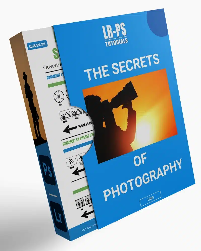
Download Your Free Guide Now!
Discover the secrets of photography with our printable guide! Master essential techniques like aperture, shutter speed, and ISO to create stunning images. Get your free printable PDF now and start turning your snapshots into masterpieces!