Optimize Web Image Quality: Sharper, Clearer, and Faster Loading
Optimize Web Image Quality: Sharper, Clearer, and Faster Loading
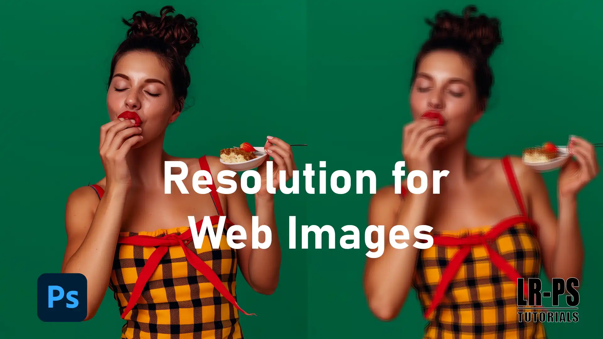
When it comes to web design, getting the right resolution for web image is very important.
It affects how quickly your site loads, which in turn impacts user experience and searchengine rankings. In this article, I’ll walk you through the essentials of image dimensions, size, and optimization.
By the end, you’ll know how to keep your website visually appealing without compromising on speed. Let’s dive in!
Table of Contents
Web Images: The Ultimate Guide
You’re getting into web images. Great! First, let’s see why resolution and image size matter.
Uploading images online, especially website images, should look good without slowing down your site.
This guide helps you understand the significant terms and practices needed to achieve that balance.
Significant Concepts
Resolution optimization: How many pixels are in one inch.
Image dimensions: The width and height of your image.
Aspect ratio: The relationship between the width and height of an image.
File size: How much space your image takes up on your computer or site.
Why Image Size Matters
For web images, image size impacts your site in a few ways. A larger image file size means longer page load times.
That’s a big no-no. Slow pages can frustrate visitors.
They may leave before your page loads, but don’t worry.
By understanding and managing image file size, you can keep your site snappy.
Resizing Image effortlessly to ensure your visuals are perfect for any platform.
Understanding why image size matters is noteworthy for maintaining quality and performance.
To optimize your images effectively.
Optimizing Images for the Web
Now, let’s get technical. Using the right image format is very important. JPEGs are great for photos with lots of colors.
PNGs work well for images with transparent backgrounds.
You might also consider webp images for their balance of quality and size.
Make sure you use multiple image sizes for different devices. It helps your site look good on desktops and mobile devices.
Practical Steps
Resize your images to avoid large images that take forever to load.
Use image compression tools to reduce file sizes without a loss of quality.
Always name your image files correctly to improve your SEO and organization.
Keep the aspect ratio consistent across your pieces.
Resize your large images to maintain the correct aspect ratio, avoiding large files that take forever to load.
Adding shapes to your images can enhance visual appeal and structure while maintaining the original aspect ratio for optimal quality. Optimizeweb image quality by incorporating well-designed shapes.
Pro Tip: Always test how your digital images, with their specific aspect ratio, look on various devices before making them live.
Optimize for both quality and speed by ensuring your images are resized to the correct aspect ratio, boosting your overall site performance.
Additionally, consider using tools like Lightroom for editing and optimizing your images, including adjusting aspect ratios where necessary.
When choosing image formats, understanding their characteristics is important. Here’s a brief look at a specific format:
High quality and widely supported, this format compresses well for smaller file sizes but does not support transparency. It’s ideal for photographs and complex images.
Aspect
Overview
Image Quality
High quality, suitable for photographs
File Size
Compresses well for smaller file sizes
Transparency Support
Does not support transparency
Suitability
Ideal for photographs and complex images
Compatibility
Widely supported across browsers
When you upload images to your website, picking the right format is crucial. JPEG, PNG, and WebP are the most regular image formats used today because they balance quality and file size efficiently.
Each format has its strengths: JPEGs are great for HD quality photos with complex colors, while PNGs offer lossless compression, ideal for images that require transparency like logos or other graphics.
Balancing Screen Resolution and Image Quality
Screen resolution also plays a big role in how your images appear.
A higher screen resolution means your images can be displayed in HD quality, making them look crisp and adding that wow factor to your site.
However, remember that higher resolutions often mean larger file sizes, which can slow down your site. It’s all about finding the right balance.
Optimizing Images for Blog Posts
For blog post or web article, ensure your blog images have the correct aspect ratio and are not larger than the maximum height and width needed.
Blog post images with the right aspect ratio prevent your site from slowing down and keep your images looking sharp and professional.
Stock images are a good resource, but they often need to be resized or cropped to fit your specific needs.
Why Image Resolution Matters for Websites
Understanding why resolution matters for websites involves more than just visual quality, it directly impacts factors like load times and user experience.
Optimizing image size and resolution ensures faster loading speeds and sharper visuals, crucial for engaging visitors and improving SEO performance.
Impact on Load Times
Think of a website as a book. Images are like pictures in the book.
High resolution image look sharp and clear.
But here’s the catch: the higher the resolution, the larger the images file size. Larger files take longer to load.
This can slow down your page load times.
What happens when your page takes too long to load? People leave.
They won’t wait around for your site to finish loading. It’s not just frustrating for users; it can also hurt your search rankings.
User Experience and Engagement
A well-chosen image enhances your content, making it more engaging. Visitors appreciate website images that load quickly and look good.
When users wait for images to load, they lose interest quickly.
For instance, vertical images should maintain balance with surrounding text. An optimized image size keeps this flow active and engaging.
Remember you’ll want your featured images to capture attention instantly.
By managing your image sizes correctly, you retain visitors’ interest and improve their experience on your site.
SEO Benefits
Search engines consider page load times in their ranking algorithms. Faster pages get more love from Google. Quick-loading blog images help you rank higher.
This step drives more traffic to your site.
That’s where image optimization comes in. Use the most common image formats like JPEGs and PNGs. Name your images correctly with keywords relevant to your content.
This practice provides an extra SEO boost.
The most important point is to keep your file size in check without compromising on quality.
Properly optimized images not only enhance visual appeal but also contribute to better overall website performance.
Pro Tip: Always consider image compression tools. They reduce file sizes without a loss in quality. You’ll achieve faster load times for your site and happier visitors
Understanding Image Resolution
Delving into the resolution is important for grasping its impact on digital visuals.
Understanding image size and resolution clarifies how clarity and file size affect web performance and user experience.
What is the Significance of it?
It refers to the number of pixels in an image. More pixels mean a clearer and more detailed image.
Think of it like a puzzle, more pieces make a detailed picture. This is especially important when you upload images to your site.
Pixels and DPI Explained
Pixels are tiny dots that make up your image, while DPI (dots per inch) indicates how many of these dots fit into an inch.
More dots mean better details. For screens, 72 DPI is generally sufficient. For prints, however, you need a higher DPI to maintain quality.
Common Resolution Optimization for Web
For web images, 72 DPI is ideal as it keeps file sizes small without losing quality. Higher DPI doesn’t offer any additional benefits online.
Resize images to ensure quick page load times, which is significant for maintaining user engagement.
Pro Tip:
Use online tools to compress before uploading large images.
Smaller files load faster, improving user experience.
Fast-loading images keep your audience engaged.
Optimization is significant.
Practice these tips, and you’ll manage your image files like a pro!
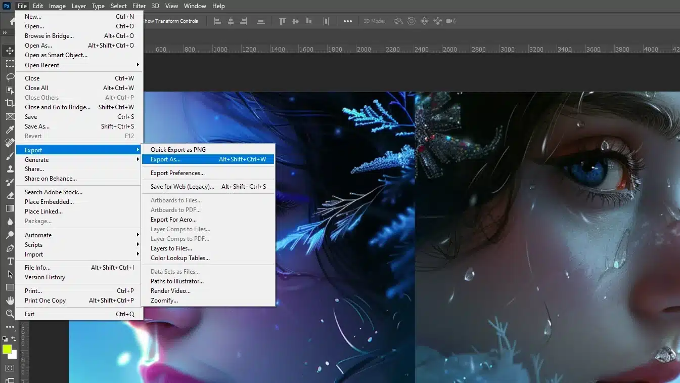
For more advanced editing, consider using tools like Photoshop or Lightroom to fine-tune your images further.
Best Practices for Web Image Resolution
Mastering best practices for web resolution involves selecting the optimal image size to balance quality and load times.
Grasping how image size impacts performance is crucial for enhancing user experience and site efficiency.
Selecting Optimal Resolution
Let’s talk about picking the right resolution for your web images. The right resolution makes your background image look sharp and clear on your webpage.
Many think higher resolutions are better, but that’s not always true for web content.
When uploading images, 72 pixels per inch (PPI) usually works well. This keeps the file size small without losing quality, which is enough for screens.
Anything more just makes the file bigger without improving how it looks.
High-res images can slow down your site a lot. No one likes waiting for a background image to load, right?
So, go for 72 PPI for background image. Your visitors will appreciate the faster load times!
Optimizing Image File Size for Speed
Speed matters when it comes to images. Large images can slow down your site, annoying visitors and hurting your SEO.
Let’s keep your image size reasonable while maintaining decent quality.
First, resize your images. Massive dimensions aren’t necessary. Think about the aspect ratio.
Properly proportioned images look balanced but don’t take up too much bandwidth.
Blog images at a medium file size load faster and still look good.
Use image compression tools to reduce file size without losing quality.
Smaller files mean faster page loads. JPEGs and PNGs are common formats that compress well.
Tools for Image Optimization
Tools can make this process easier. Here are a few useful ones for optimizing images, whether they’re stock photos or your own:
Photoshop: Great for detailed editing and resizing. Learn Photoshop shortcuts to speed up your workflow.
Lightroom: Good for quick adjustments. Essential tools in Lightroom can help you optimize images efficiently.
TinyPNG: Compresses images to keep file sizes small.
ImageOptim: Another tool for image compression.
Canva: Offers a free version for straightforward resizing.
Pro Tip: Always name your images properly. Use descriptive image names that match your content. This improves SEO and makes images easier to find later!
How to Optimize The Web Image Resolution for Different Devices
Optimizing images means making your website look good and load fast on all devices. Whether it’s a laptop, smartphone, or tablet, we need to tweak those images right.
Responsive Images
So, what’s up with responsive images? You want your website to look good on any screen size, right? Responsive image help make that happen.
They adjust according to the device viewing them. If you have a large background image for desktops, it should shrink for mobile devices without losing clarity.
This means using multiple image sizes.
Imagine serving different meals for different tastes. Some people like small portions; some like big ones. Your images should do the same.
Smaller images for phones, larger ones for desktops. Most web builders and content management systems have tools to help with this.
Retina Display Considerations
Let’s talk about Retina displays. These screens have more PPI. Regular images can look blurry.
Say you’re using a hero image banner. It needs to look sharp on both regular and Retina screens.
How do we fix this? Double the resolution of your images. It makes the image size a bit larger, but it keeps everything crisp.
Again, it’s like serving food. Retina users have a sharper “taste” and need better quality images.
Preparing high-res images specifically for Retina ensures satisfaction.
Mobile vs. Desktop Optimization
Mobile devices need special attention. On mobile, you don’t want to be uploading large photoso; they slow down your site.
Optimize for smaller screens, shrink image dimensions, and compress your files. Avoid full-width images on mobile – they don’t fit well and make users scroll.
For desktop, you can afford slightly larger image sizes. But remember, no one wants a website that’s slower than a snail. Keep an eye on image size.
Tailor Your Approach:
For mobile, use compressed image and test the aspect ratio.
For desktop, consider the visual impact – think hero images and full-screen banners.
Pro Tip: Always test your website with tools like Google PageSpeed Insights to see how well optimized your images are for different devices.
Enhancing Images for Responsive Websites
Enhancing images for responsive websites involves adeptly managing file size and employing effective compression techniques.
Understanding how to optimaze blog images for various devices ensures a seamless user experience and faster loading times
Managing File Size and Compression Techniques
For responsive websites, it’s important to ensure that the largest image doesn’t compromise the entire height of the page due to large file sizes.
Utilizing lossy compression can effectively reduce the file size while maintaining an acceptable level of quality.
Always aim for the minimum size that still provides clear and effective visuals, particularly when dealing with product images.
Enhancing Product Images for Better SEO
Product images are important for e-commerce and need special attention to ensure they load quickly and look good on all devices.
Including alt tags with your product images enhances SEO, making your site more accessible and improving its ranking.
Repeat alt tags on all your product images to reinforce SEO benefits.
When designing for responsive websites, product images should scale properly across devices.
This means the largest image file must not only be compressed but also should not exceed the entire height or width necessary for viewing on larger screens.
Alt tags should be used consistently across product images to ensure they are fully optimized for SEO.
Additional Tips for Image Optimization
When working with images, tools like Photoshop and Lightroom can be incredibly helpful.
For instance, you can use the content-aware fill to seamlessly remove unwanted elements from your images, ensuring they look perfect across all devices.
Additionally, Photoshop shortcuts can speed up your workflow, allowing you to quickly adjust image sizes and quality for various screens.
That’s it! Follow these tips to make sure your web pages load quickly and look great on any device.
It’s all about balancing image size and quality to give your audience the best experience.
Common Mistakes to Avoid in Web Images
One of the biggest issues with web images involves common mistakes. Let’s dive in and learn what to avoid. You’ll save time, and your visitors will have a smoother experience.
Using High-Resolution Images Unnecessarily
High resolution images look great in print but not always on the web. Larger images mean slower load times, which frustrates users.
We often think more pixels equal better quality, but for the web, this isn’t true.
The resolution for web image is 72 PPI.
Compressing Images Properly
If you use larger image sizes, your site slows down. Nobody wants to wait for a hero image to load. Compress those high-res images and make everyone happy.
Use smaller files while keeping good quality.
Your site will thank you. Tools like Photoshop can help you resize and compress images efficiently.
Overlooking File Formats
Image file formats matter a lot. They affect how images look and how quickly they load. JPEGs are great for photos. PNGs are good for images needing transparency.
Never ignore the most common image formats. AVI, BMP, and TIFF? Just say no.
Stick with JPEG, PNG, or even scalable vector graphics.
Format Selection Tips
Always choose the format that balances quality and file size. For instance, blog images as JPEGs load faster since they compress well.
This simple step can improve your page speed significantly.
Understanding the difference between NEF or JPEG format can also be beneficial for photographers looking to optimize their images for the web.
Not Testing Across Devices
Web images need to look good everywhere. If it looks great on a desktop but terrible on a phone, you’ve got problems.
Always test your images on desktops, tablets, and mobile devices.
The aspect ratio often changes between these devices.
Ensuring Consistent Quality
Hero images that span full screen on a desktop might look odd on a phone. Full-width images on mobile devices can be a mess.
Shrink your image file sizes and keep testing until you’re sure everything looks good. Better performance means happier visitors.
Pro Tip: Always name your image files with relevant keywords. It helps users and search engines understand its content.
Proper naming improves your SEO and makes your life easier. Life is complicated enough; don’t make your image management unnecessarily tricky!
Frequently Asked Questions (FAQs)
What size resolution should a website image be?
Website images should generally be sized to match the display container on your website. This helps in loading the website faster and improving site performance.
Ideal resolutions for website images are typically between 1500 and 2500 pixels wide for full-width displays.
What resolution is best for website images?
The best resolution for website images depends on the purpose of the image. For background image, 1920 x 1080 pixels is commonly used.
For smaller images like thumbnails or product photos, resolutions around 800 x 600 pixels work well.
Is 72 DPI the same as 300 PPI?
No, 72 DPI (dots per inch) is not the same as 300 PPI (pixels per inch). DPI refers to the number of ink dots per inch a printer can place on paper, while PPI describes the number of pixels per inch in a digital image.
72 DPI is commonly used for web images, which are viewed on screens, whereas 300 PPI is used for images that need to be printed at a high quality.
What is a good DPI for web images?
A good DPI for web images is typically 72 DPI. This resolution is optimized for fast loading times and good display quality on most screens.
Increasing DPI for web images does not necessarily improve display quality but can increase file sizes, affecting website performance.
$2,061.00Original price was: $2,061.00.$1,061.00Current price is: $1,061.00. 27581
Download Your Free Guide Now!
Discover the secrets of photography with our printable guide! Master essential techniques like aperture, shutter speed, and ISO to create stunning images. Get your free printable PDF now and start turning your snapshots into masterpieces!


