Have you ever stopped to admire the vast spectrum of color range in a rainbow?
Imagine having the same infinite possibilities at your fingertips when choosing colors for anything from your artwork to the walls of your room.
Color ranges offer us this exciting liberty, turning ordinary projects into delightful expressions of our personalities.
Therefore, let’s explore why embracing a wide color range can dramatically enhance our creativity and daily environment!
Table of Contents
Resizing Images in Photoshop for Optimal Color Range
Resizing images can impact their color fidelity.
Here, we’ll guide you through resizing while maintaining the optimal color range.
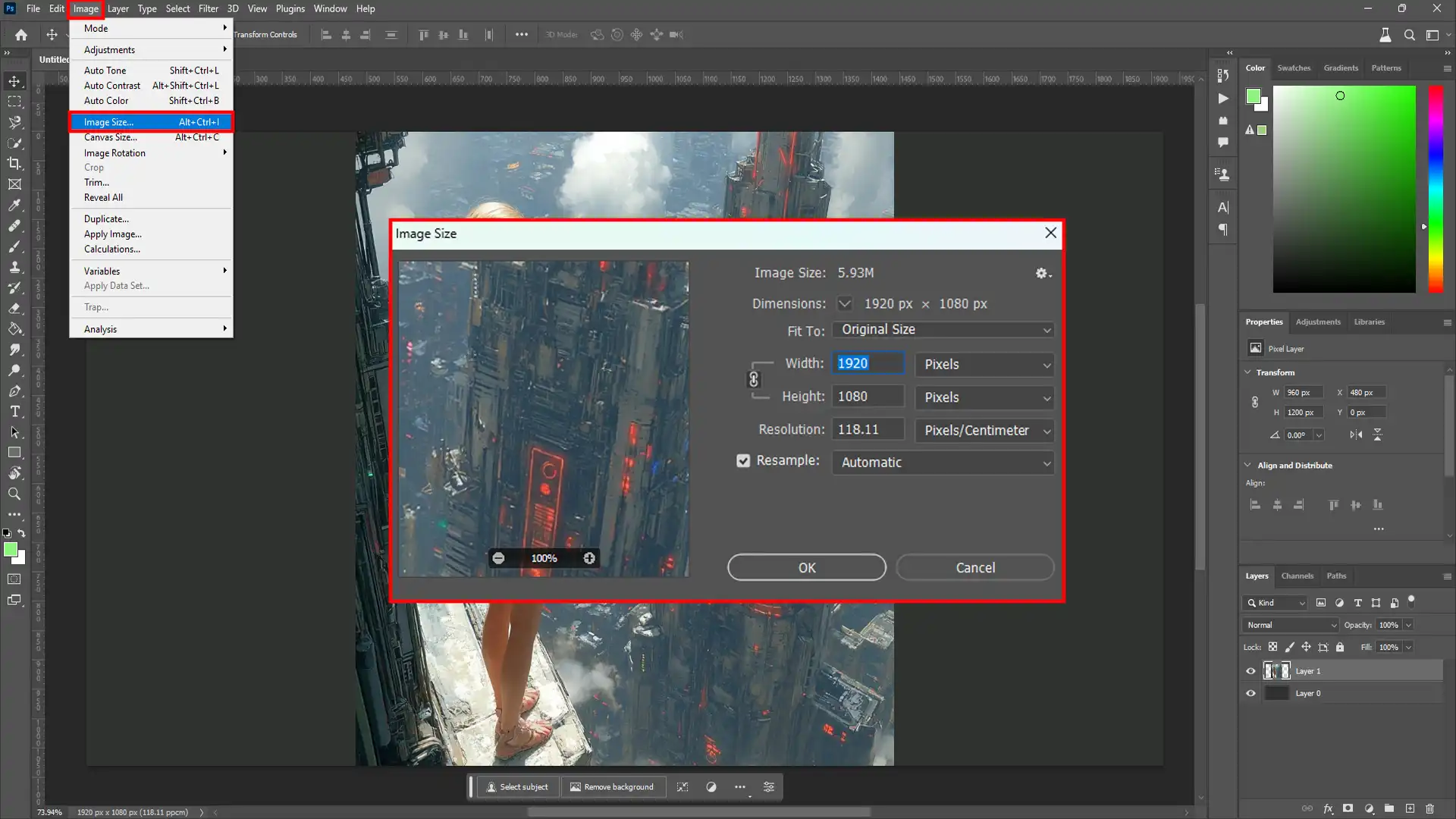
Step-by-Step Guide to Adjust Image Size
To resize an image:
First, open your image in Adobe Photoshop.
Second, navigate to the "Image" menu and select "Image Size."
Then, a dialog box appears with options for adjusting dimensions and resolution.
Adjust dimensions while keeping "Constrain Proportions" checked to prevent distortion.
Lastly, apply changes by clicking "OK."
For better results, preserve high-resolution photos and work non-destructively using smart objects.
Tips for Maintaining Color Integrity During Resize
Maintaining color integrity is crucial during resizing.
Here are some essential tips:
Use Smart Objects: Transform layers into smart objects before resizing to protect the original pixel data.
Color Profiles: Ensure color profiles are consistent across workflow stages.
Preserve Details: When reducing size, use the “Preserve Details” algorithm, available in the "Image Size" dialog box, for sharper imagery.
Example: When I resized a landscape photo at home, I used smart objects throughout my edits and noticed that the colors remained rich even after several size adjustments.
Moreover, using these tips for Lightroom editing will help you maintain the original hues, which is particularly vital when dealing with specific skin tones or landscapes with vibrant greenery and blue skies.
Common Mistakes to Avoid When Resizing Images
Mistakes can degrade your images’ quality and color fidelity during resizing. Below are common errors:
1.Ignoring Aspect Ratios:
Distorted images result from misaligned aspect ratios.
Always keep "Constrain Proportions" enabled.
2. Not Using Smart Objects:
Directly resizing raster layers leads to pixelation.
Convert layers to smart objects first.
3. Neglecting Resolution needs:
Web images differ from print requirements (72 PPI vs 300 PPI).
Set appropriate resolution based on output intent.
4. Overlooking Color Profiles:
Mismatched profiles can alter displayed colors or cause inaccuracies in print.
5. Skipping Preview Adjustments:
Always preview resized image sections before applying final changes.
By following these tips and avoiding these mistakes, you can ensure that your resized images retain excellent visual integrity across different web or print platforms.
Understanding Color Range in Digital Images
Color range is crucial in digital imaging, impacting the final output’s quality and appeal.
Here, we will explore the color range in detail.
Mastering the Color Range Dialog Box
The Color Range dialog box is a powerful tool for selecting and adjusting specific colors within an image.
Moreover, by using options like the eyedropper tool and fuzziness slider, you can target the exact color and make detailed edits, enhancing your work’s overall quality and creativity.
Definition and Importance of Color Range in Imaging
The color range refers to the variation of colors present within an image.
It determines how diverse and vibrant the colors appear.
A wide color range captures vivid hues.
A narrow color range results in duller images.
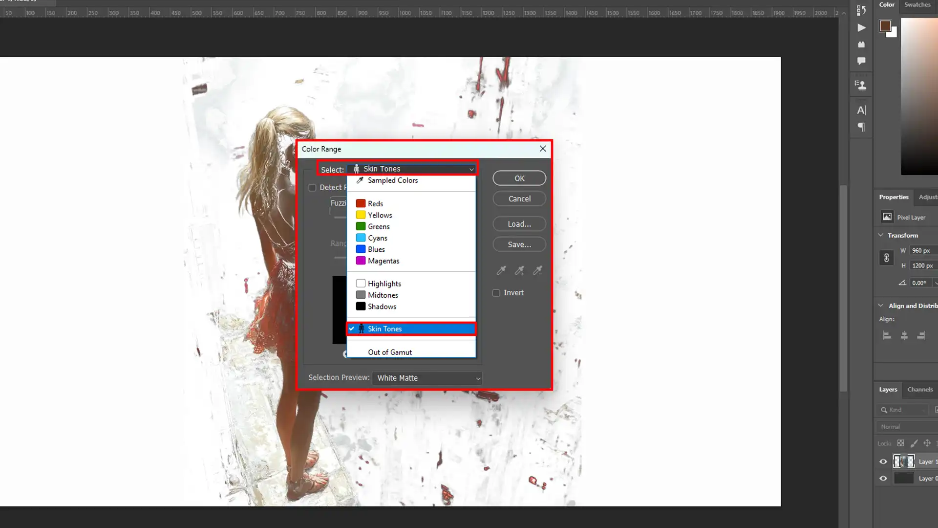
Using tools like the color range command, photographers can isolate specific colors. This process helps enhance areas such as skin tones or highlights.
For instance, while editing an image, you might use the eyedropper tool along with the plus sign option to sample colors from a reference image to achieve the desired effect.
Lastly, adjusting skin tones with precision ensures they look natural and attractive.
Example: My experience with a high-resolution portrait revealed grayish skin tones under poor lighting.
Using the color range command and the plus sign to add to the selection, I corrected this effectively by targeting only the problematic areas of the image while preserving other details.
Different Color Models and Their Impact on Image Quality
Different color models, such as RGB, and CMYK, impact an image’s quality and presentation.
Each model represents color differently, influencing how we perceive images on various screens:
1. RGB (Red, Green, Blue):
Used for digital displays.
Has a broader color gamut.
2. CMYK (Cyan, Magenta, Yellow, Black):
Ideal for print media.
Produces accurate printed colors but has a smaller gamut compared to RGB.
Both models affect tasks like adjusting saturation or using selection preview within the photo editing software.
Understanding these differences allows precise adjustments and improves overall output quality.
Important Differences Between RGB and CMYK
Knowing your target medium, digital, like different types of lenses, or print, lets you optimize your workflow using appropriate tools within editors like Adobe Photoshop’s selection preview menu or adjusting ranges through sliders for each model.
These insights enrich your skills for tasks like refining entire image localized color clusters or handling more specific enhancements through detailed operations in software environments.
Here’s a quick comparison between RGB and CMYK color models, detailing their usage, color gamut, and applications for digital displays and print media
Feature
RGB
CMYK
Color Model
RGB
CMYK
Usage
Digital Displays
Print Media
Color Gamut
Broader
Narrower
Typical Application
Screens (Computers/Phones)
Printers
Color Representation
Light-based
Ink-based
Expanding Color Range Using Adobe Photoshop
Broadening your photos’ color range can bring new life into your images.
Adobe Photoshop offers many techniques to enhance colors and make your visuals more vibrant and appealing.
Techniques to Broaden Color Spectrum in Photos
Several techniques can be employed to expand the color range, ensuring each hue stands out.
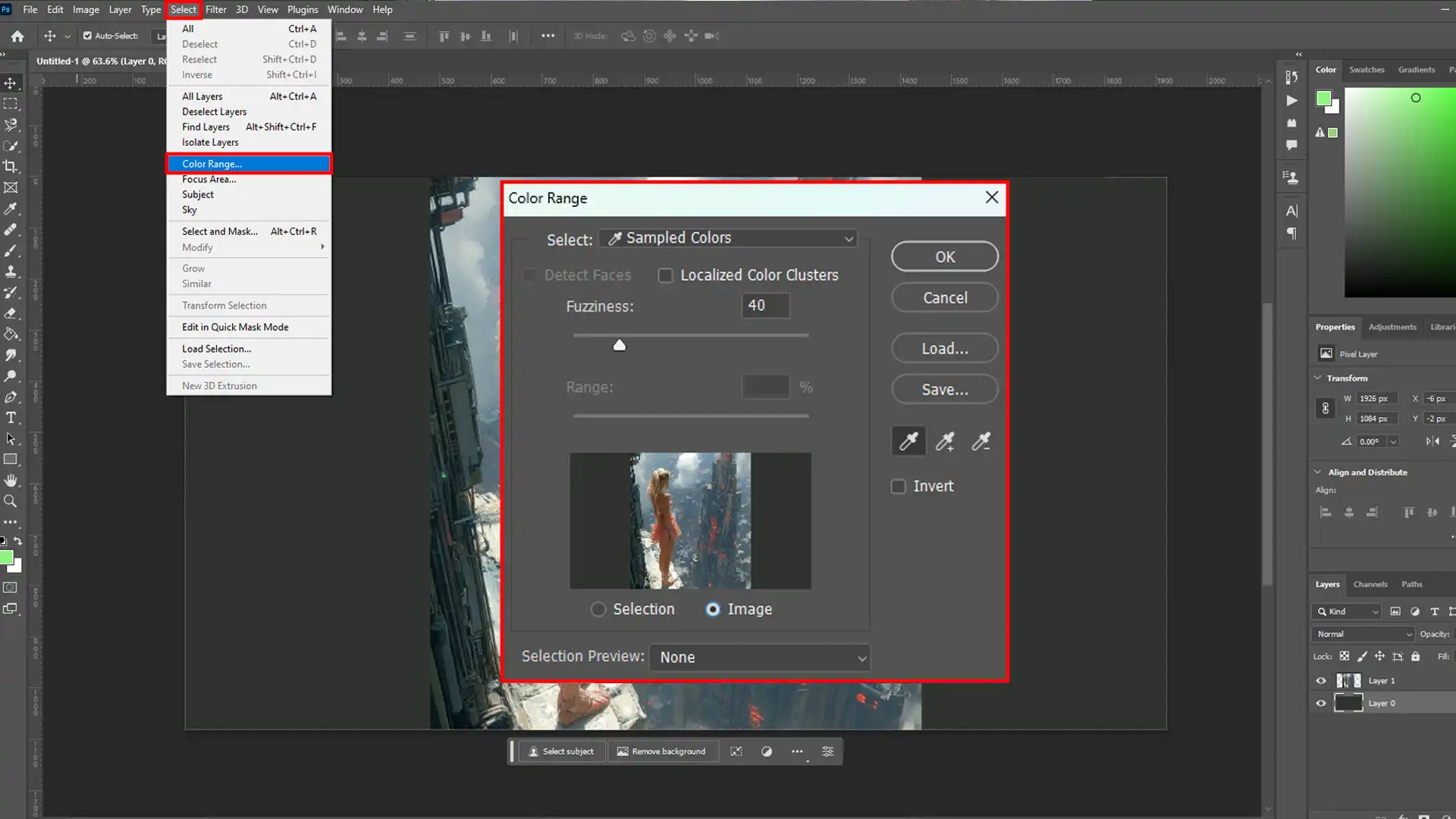
Utilize the Color Range Command:
First, open your image.
Second, go to the Select Menu and choose "Color Range."
Then, use the eyedropper tool to click on the colors you want to adjust in the color range dialog box.
Lastly, adjust the fuzziness slider for a more detailed selection.
Fine Tune Selection with Adjustment Layers:
Adding adjustment layers helps control specific colors without altering all the pixels.
Select the preview area using any preferred selection tool.
Apply adjustment layers like Hue/Saturation or Curves.
Enhance Skin Tones:
Use targeted adjustments for natural-looking enhancements.
Correcting skin tones is typically helpful for portraits and ensures your subject looks their best.
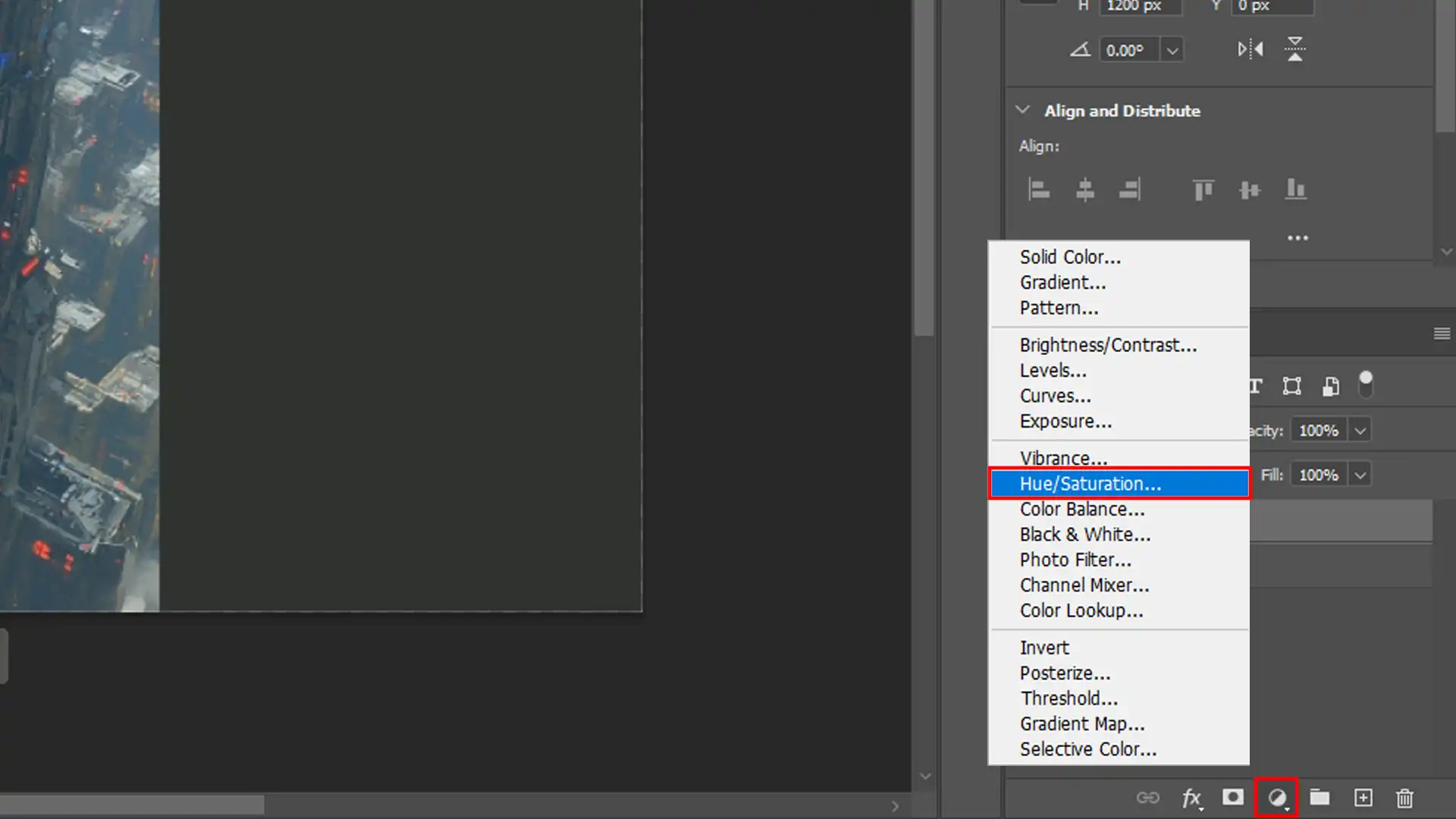
Using Adjustment Layers to Enhance Colors
Adjustment layers offer nondestructive editing advantages, making it easier to revert changes if needed.
Add a Hue/Saturation Layer:
First, go to Layer > New Adjustment Layer > Hue/Saturation.
Then, adjust sliders as necessary while monitoring changes in real time.
Selective Color Adjustments:
Reds: Increase saturation slightly, enhancing vibrancy without oversaturating the original selection areas.
Greens: Make subtle increases for lush foliage shots.
Blues: Perfect ocean or sky adjustments; keep it natural.
Curves Adjustment Layer: Adds depth by manipulating tonal ranges:
First, add a new adjustment layer via Layer > New Adjustment Layer > Curves.
Then, modify RGB channels individually for fine-tuned results across different color spectrums.
Enhancing Skin Tones in Photoshop
Adjusting skin tones is crucial for creating natural and appealing portraits.
Use tools like the Color Range dialog box command to isolate skin tones and apply fine-tuned adjustments.
This ensures the skin retouching appears smooth and vibrant, avoiding unnatural hues.
Using the Selection Preview for Accurate Edits
The Selection Preview feature in Photoshop allows you to visualize your color adjustments in real time.
This helps make precise selections from the selection tool and ensures that only the desired areas are affected, making your editing process more efficient and accurate.
The selection preview option can be especially helpful when you want to refine specific areas without disturbing the overall composition
Moreover, always remember that the key to broadening color spectra is to balance striking visuals and natural appeal without overediting!
Note: Integrate these steps into larger projects seamlessly by referring back here whenever necessary to perfect comprehensive editing workflows!
Optimizing Colors in Photographs for Print and Digital Media
Color optimization is crucial for ensuring your images look stunning across different platforms.
Whether you’re preparing your photographs for print or digital display, mastering color adjustment techniques will elevate your work.
Best Practices for Color Optimization in Various Media
To achieve the best color results, follow these essential practices tailored for print and digital media.
Calibrate Your Monitor - Calibrate your monitor regularly to ensure it accurately displays the colors. This step is fundamental to achieving consistent colors.
Use the Right Color Spaces - For digital media, use sRGB color space, which ensures compatibility with most screens.
For print, consider Adobe RGB to capture a broader range of colors.
Adjusting Using the Color Range Command In Photoshop - The color range command allows you to make precise selections within an image based on color values.
This tool is invaluable for editing specific areas, mainly when working with diverse tones like smooth skin tones, as demonstrated below:
Open Image: Start by opening the actual image in Photoshop.
Select Menu: Go to "Select" and choose "Color Range."
Sampled Colors: Use the Eyedropper tool to sample desired colors.
Fine Tuning with Selection Preview - The selection preview option helps visualize partially selected areas from the selection tool before making adjustments.
This feature ensures accuracy and saves time.
How to Achieve Consistent Color Across Different Platforms
Achieving uniformity in photo representation across platforms involves several steps:
Understanding Output Requirements – Each medium (print or digital) has unique requirements. Understand these needs before editing your photos.
Here are some Editing Techniques:
Use fuzziness slider: It refines selection edges.
Work within the color range dialog box: Adjust sampled colors efficiently.
Apply selection outline: Helps visualize changes to ensure they won't affect unwanted areas.
Example: While adjusting a portrait’s background:
First, open the photo in Photoshop.
Second, navigate to "Select" > "Color Range".
Then, sample a section of the background using the Eyedropper tool.
Adjust using the options available within the preview area until you are satisfied with how it looks compared to skin tones or other elements within the image.
Lastly, make final edits utilizing tools such as layers and masks.
Consistent editing ensures what you see on the screen matches printed versions closely.
Incorporating software tools like Lightroom enhances efficiency by providing presets and batch edit features, which help sustain uniformity over numerous files.
The Role of Color Profiles in Maintaining Color Range
In digital photography, color profiles are essential to preserve the color range of images and ensure consistency across devices.
Exploring Different Color Profiles and Their Uses
Choosing the right color profile can significantly affect your final output.
Let’s get started with some commonly used color profiles and their applications.
sRGB: Widely used for web images due to its broad compatibility.
Adobe RGB: Best for printing because of its wider color gamut.
ProPhoto RGB: Ideal for high-end professional work with extensive color ranges.
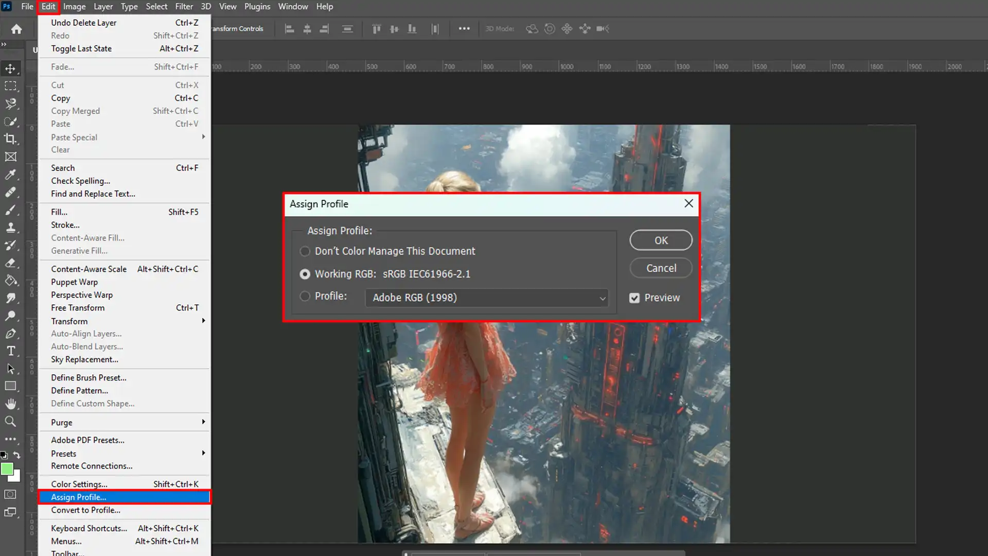
How to Apply Color Profiles in Photoshop
Applying and managing color profiles in Photoshop is straightforward. Here’s how:
First, open your document window.
Then, navigate to the Edit menu, then select Assign Profile.
To refine your adjustments, use the Select Menu to access tools like the selection outline. This will help you focus on specific areas that need color correction.
Lastly, choose from predefined profiles or customize them according to your needs.
Use options like the fuzziness slider and preview within the document window before finalizing decisions.
Another helpful feature for precise adjustments is the range slider, which helps you tweak when working on localized color clusters within your image.
Moreover, by carefully selecting appropriate color profiles and applying them through Photoshop’s powerful tools, you can achieve stunning results that stay true to the original scene’s vibrant colors and detailed nuances.
Pro Tip: To further enhance your photo editing journey, explore the capabilities of Photoshop and Lightroom directly through Adobe.
For even more control over your color profiles and adjustments, consider using camera raw within Photoshop. Camera Raw allows you to make precise, non-destructive edits to your images.
Correcting Color Range Issues in Photoshop
Addressing color range issues in Photoshop can dramatically improve the quality of your photos.
You’ll be able to make precise edits and perfect your images.
Identifying and Fixing Color Range Errors
To identify and fix color range errors, open your image in Photoshop and follow these steps:
First, go to the Select menu and choose Color Range Command.
Then, a color range dialog box will appear. Here, you can pick sampled colors from your image using the sample tool to select problematic areas. If needed, you can remove colors that don't belong to the desired palette to improve overall color harmony.
Lastly, the preview area helps you visually check the adjustments before applying them.
For instance, if you’re editing a portrait with uneven skin tones:
First, use the eyedropper to sample skin tones.
Then, adjust fuzziness for smoother transitions.
Lastly, remove colors that don't match by refining selections with additional samples.
If some areas remain only partially selected, switch to quick mask mode for more precision. Using quick mask mode, you can fine-tune your selections further by painting over the areas that need adjustment.
Allowing for better control over the selection boundaries and ensuring an even color range throughout your image.
This method is especially useful when you need to remove colors that are still subtly present, helping maintain a consistent and natural appearance.
Advanced Tools and Techniques for Color Correction
Once you’ve identified problem areas, you can use advanced tools to correct them effectively:
Localized Color Clusters: This option is enabled in the color range dialog box to isolate sampled colors more precisely.
Adjust specific hues or shades using adjustment layers like Hue/Saturation or Levels.
Replace the same color within selections using brush tools or layer masks for manual touch-ups.
For example, imagine fixing a landscape photo with overly bright blue skies:
First, use the hue adjustment layer to shift the blue's intensity.
Then, apply a selective color balance correction.
Lasly, utilize blending modes like Multiply or Screen for final touches.
Additionally, while performing lens corrections, pay attention to small details such as brightness and darker regions.
By mastering these techniques, your images will look vibrant and balanced.
Using Layers to Manipulate Color Range in Composites
Layers are essential for manipulating color ranges in complex composite images.
Moreover, let’s see how to use layers effectively.
Layer-Based Editing to Enhance Color Dynamics
When working on a composite, layer-based editing offers precise control over colors and tones.
Create Adjustment Layers: Adjustment layers such as Hue/Saturation or Brightness/Contrast can be applied to specific layers without affecting the entire image. For example, adding a Hue/Saturation adjustment layer allows you to fine-tune the saturation and hues of your selection tool areas while previewing changes in real-time. You can isolate a specific color for more targeted adjustments, ensuring accurate results
For example, adding a Hue/Saturation adjustment layer allows you to fine-tune the saturation and hues of your selection tool areas while previewing changes in real-time.
Clipping Masks: Use clipping masks to limit adjustments to one particular layer. This technique keeps the edits contained, ensuring that only the targeted preview area sees changes. If you're working on a layer that contains a white matte or black matte, clipping masks can help maintain the integrity of these areas while adjusting the rest of the composition
Blending Modes: Experiment with blending modes like Overlay, Soft Light, or Multiply to enhance color dynamics between layers. This method allows for more control over how each specific color blends with others, providing unique effects and adjustments.
Each blending mode interacts differently with underlying colors, sometimes amplifying brightness or deepening shadows (e.g., making black areas even darker).
Sample Process:
First, add an adjustment layer for overall color correction.
Then, use clipping masks to limit these corrections, especially if working with white matte, black matte, or gray areas sections that need to remain unaffected by broader adjustments.
Lastly, try different blending modes on each layer to see varied results.
Blending Modes and Their Effect on Color Range
Understanding blending modes can drastically change how your actual image looks by altering the exact color range.
Different modes affect colors in unique ways.
Overlay Mode: This blending mode enhances contrast while maintaining original pixel colors.
Multiply Mode: A useful mode for darkening images, it multiplies base layer pixel values by blending layer pixel values. This method is excellent for adding depth, particularly when working with sampled colors from your image.
Screen Mode: This mode is perfect if you want to lighten parts of your image. It inversely multiplies the pixels of the base and blend layers, yielding a lighter result.
Color Mode: Keeps luminance from base content but applies hue and saturation from the blend content, offering a powerful way to re-colorize specific sections of your composite image.
Frequently Asked Questions
Does Photoshop Elements have a color range?
Photoshop Elements includes the Color Range feature for selecting and adjusting specific colors.
How do you replace a color range in Photoshop?
Use the Color Range dialog box to select the desired color, then apply adjustments or replace it using the Hue/Saturation adjustment layer.
What is the color range mask in Photoshop?
A color range mask allows you to isolate and edit specific colors within an image, therefore, using the Color Range selection to create a mask.
How to change the color scale in Photoshop?
Use the Image > Adjustments > Levels or Curves to change the color scale, adjusting the tones and colors in your image.
The Color Range dialog box in Photoshop offers me unparalleled flexibility and creative control for photo editing. By utilizing the preview area and selection preview, I can precisely adjust color values and target specific colors within my images.
Whether I’m working with gray shades or vibrant hues, the intuitive controls allow for detailed and accurate modifications.
The options for white matte, black matte, quick mask, and the document window enhance clarity and efficiency, ensuring that every edit I make is intentional and refined.
Recognizing partially selected and gray areas adds another layer of precision, preventing unintended changes.
Therefore, for those looking to elevate their image editing skills, consider enrolling in our comprehensive Photoshop course and Lightroom course.
If this article has helped you, then Like and Share it with your friends
$2,061.00Original price was: $2,061.00.$1,061.00Current price is: $1,061.00. 27584
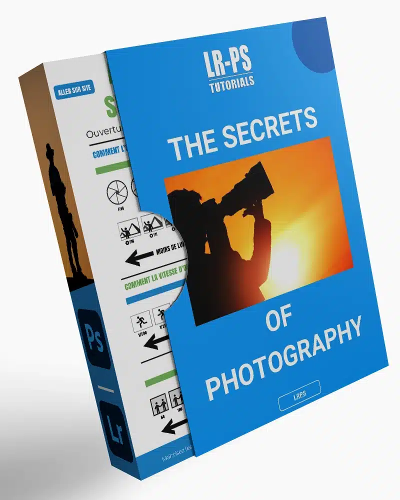
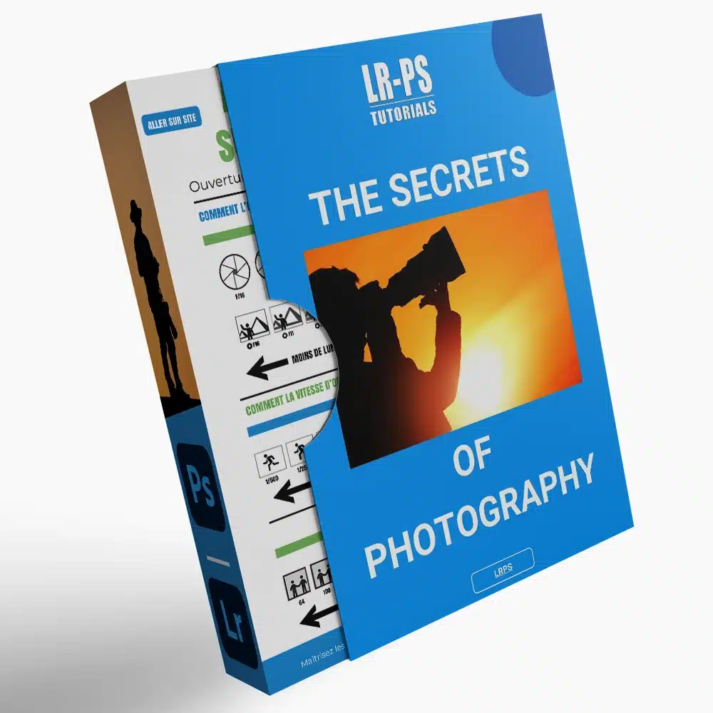
Download Your Free Guide Now!
Discover the secrets of photography with our printable guide! Master essential techniques like aperture, shutter speed, and ISO to create stunning images. Get your free printable PDF now and start turning your snapshots into masterpieces!